副标题:
- 所有的大样本量差异分析都可以转为拟时序分析
- 两个分组的差异分析仅仅是上下调吗?
很多小伙伴在后台表示对单细胞数据分析里面的拟时序分析不理解,恰好最近看到了一个超级清晰明了的展现拟时序分析的作用的文献,分享给大家。它完美的展现了差异分析为什么不够,为什么拟时序分析就是差异分析的细节剖析。
发表在NATURE COMMUNICATIONS | (2021) 的 文章:《CD177 modulates the function and homeostasis of tumor-infiltrating regulatory T cells》,链接是:https://www.nature.com/articles/s41467-021-26091-4 就做了差异分析:
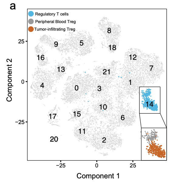
最开始是 13,433 PB and 12,239 TI cells,整体来进行降维聚类分群后,根据 FOXP3 and CD25 (IL2RA) 定位到Treg亚群, 分别是 160 PB and 574 TI Treg cells
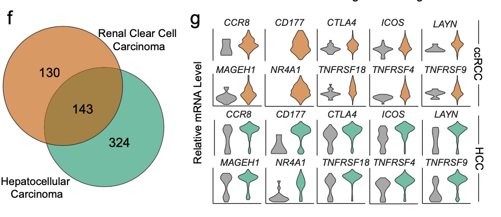
如果是这两个分组做差异分析,273 differentially-expressed genes (DEGs) (Log fold-change > 1, adjusted p-value < 0.05) by comparing TI versus PB Treg cells.
而且作者在自己的ccRCC单细胞矩阵里面以及一个公共数据集HCC里面,都展现了类似的差异分析,并且筛选共有基因:
这样的差异分析,尽管说做了交集,但是仍然是很多细节丢掉了,得到的仅仅是上下调这样的属性,忽略了它具体的每个基因在这两个单细胞亚群里面的渐变的趋势。
既然细胞数量并不多,跑一下 Monocle 2 algorithm ,可以看清楚上下调的变化趋势,甚至发现隐藏的变化模式:
首先是拟时序
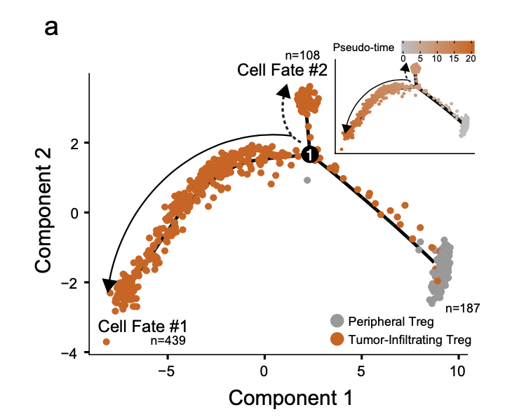
a Trajectory manifold of Treg cells from the ccRCC using the Monocle 2 algorithm. Solid and dotted lines represent distinct cell trajectories/fates defined by expression profiles.
拟时序虽然就展现了上面的一个图,但是具体的代码步骤还是有点难度哦。下面的代码是复制粘贴即可使用的哈,我们以 SeuratData包里面的 pbmc3k 数据集举例说明,主要是需要把Seurat包的对象转变为 monocle里面的单细胞对象!
library(SeuratData) #加载seurat数据集
getOption('timeout')
options(timeout=10000)
#InstallData("pbmc3k")
data("pbmc3k")
sce <- pbmc3k.final
library(Seurat)
table(Idents(sce))

sce$celltype = Idents(sce)
sce= sce[,sce$celltype %in% c('CD14+ Mono','FCGR3A+ Mono')]
table(Idents(sce))

library(monocle)
sample_ann <- sce@meta.data
head(sample_ann)
# rownames(sample_ann)=sample_ann[,1]
gene_ann <- data.frame(
 gene_short_name = rownames(sce@assays$RNA) ,
 row.names = rownames(sce@assays$RNA)
)
head(gene_ann)

pd <- new("AnnotatedDataFrame",
 data=sample_ann)
fd <- new("AnnotatedDataFrame",
 data=gene_ann)
ct=as.data.frame(sce@assays$RNA@counts)
ct[1:4,1:4]

sc_cds <- newCellDataSet(
 as.matrix(ct),
 phenoData = pd,
 featureData =fd,
 expressionFamily = negbinomial.size(),
 lowerDetectionLimit=1)
sc_cds

library(monocle)
sc_cds
sc_cds <- detectGenes(sc_cds, min_expr = 1)
sc_cds <- sc_cds[fData(sc_cds)$num_cells_expressed > 10, ]
sc_cds

cds <- sc_cds
cds <- estimateSizeFactors(cds)
cds <- estimateDispersions(cds)

# 并不是所有的基因都有作用,所以先进行挑选,合适的基因用来进行聚类。
disp_table <- dispersionTable(cds)
unsup_clustering_genes <- subset(disp_table, mean_expression >= 0.1)
cds <- setOrderingFilter(cds, unsup_clustering_genes$gene_id)
plot_ordering_genes(cds)
plot_pc_variance_explained(cds, return_all = F) # norm_method='log'
# 其中 num_dim 参数选择基于上面的PCA图
cds <- reduceDimension(cds, max_components = 2, num_dim = 6,
 reduction_method = 'tSNE', verbose = T)
cds <- clusterCells(cds, num_clusters = 6)
plot_cell_clusters(cds, 1, 2 )
table(pData(cds)$Cluster)
colnames(pData(cds))

table(pData(cds)$Cluster,pData(cds)$new)
plot_cell_clusters(cds, 1, 2 )

save(cds,file = 'input_cds.Rdata')
有了前面的 input_cds.Rdata 文件,保证前面的步骤不要有错误哦,接下来才可以运行 拟时序分析的主程序哦!
rm(list=ls())
options(stringsAsFactors = F)
library(monocle)
library(Seurat)
load(file = 'input_cds.Rdata')
# 接下来很重要,到底是看哪个性状的轨迹
colnames(pData(cds))
table(pData(cds)$Cluster)
table(pData(cds)$Cluster,pData(cds)$celltype)
plot_cell_clusters(cds, 1, 2 )
## 我们这里并不能使用 monocle的分群
# 还是依据前面的 seurat分群, 其实取决于自己真实的生物学意图
pData(cds)$Cluster=pData(cds)$celltype
table(pData(cds)$Cluster)
Sys.time()
diff_test_res <- differentialGeneTest(cds,
fullModelFormulaStr = "~Cluster")
Sys.time()
# Select genes that are significant at an FDR < 10%
sig_genes <- subset(diff_test_res, qval < 0.1)
sig_genes=sig_genes[order(sig_genes$pval),]
head(sig_genes[,c("gene_short_name", "pval", "qval")] )
cg=as.character(head(sig_genes$gene_short_name))
# 挑选差异最显著的基因可视化
plot_genes_jitter(cds[cg,],
grouping = "Cluster",
color_by = "Cluster",
nrow= 3,
ncol = NULL )
cg2=as.character(tail(sig_genes$gene_short_name))
plot_genes_jitter(cds[cg2,],
grouping = "Cluster",
color_by = "Cluster",
nrow= 3,
ncol = NULL )
# 前面是找差异基因,后面是做拟时序分析
# 第一步: 挑选合适的基因. 有多个方法,例如提供已知的基因集,这里选取统计学显著的差异基因列表
ordering_genes <- row.names (subset(diff_test_res, qval < 0.01))
ordering_genes
cds <- setOrderingFilter(cds, ordering_genes)
plot_ordering_genes(cds)
cds <- reduceDimension(cds, max_components = 2,
method = 'DDRTree')
# 第二步: 降维。降维的目的是为了更好的展示数据。函数里提供了很多种方法,
# 不同方法的最后展示的图都不太一样, 其中“DDRTree”是Monocle2使用的默认方法
cds <- reduceDimension(cds, max_components = 2,
method = 'DDRTree')
# 第三步: 对细胞进行排序
cds <- orderCells(cds)
# 最后两个可视化函数,对结果进行可视化
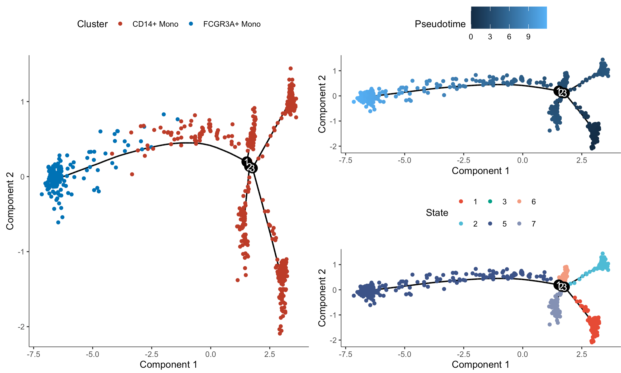
plot_cell_trajectory(cds, color_by = "Cluster")
ggsave('monocle_cell_trajectory_for_seurat.pdf')
length(cg)
plot_genes_in_pseudotime(cds[cg,],
color_by = "Cluster")
ggsave('monocle_plot_genes_in_pseudotime_for_seurat.pdf')
# https://davetang.org/muse/2017/10/01/getting-started-monocle/
my_cds_subset=cds
# pseudotime is now a column in the phenotypic data as well as the cell state
head(pData(my_cds_subset))
# 这个differentialGeneTest会比较耗费时间
my_pseudotime_de <- differentialGeneTest(my_cds_subset,
fullModelFormulaStr = "~sm.ns(Pseudotime)",
cores = 1)
# 不知道为什么无法开启并行计算了
head(my_pseudotime_de)
save( my_cds_subset,my_pseudotime_de,
file = 'output_of_phe2_monocle.Rdata')
有了上面的 output_of_phe2_monocle.Rdata 文件,就是拟时序分析的结果, 接下来就可以进行各种各样的可视化啦!首先看看每个细胞的时序信息:
## 后面是对前面的结果进行精雕细琢
rm(list=ls())
options(stringsAsFactors = F)
library(Seurat)
library(gplots)
library(ggplot2)
library(monocle)
library(dplyr)
load(file = 'output_of_phe2_monocle.Rdata')
cds=my_cds_subset
colnames(pData(cds))
table(pData(cds)$State,pData(cds)$Cluster)
library(ggsci)
p1=plot_cell_trajectory(cds, color_by = "Cluster") + scale_color_nejm()
p1
ggsave('trajectory_by_cluster.pdf')
plot_cell_trajectory(cds, color_by = "celltype")
p2=plot_cell_trajectory(cds, color_by = "Pseudotime")
p2
ggsave('trajectory_by_Pseudotime.pdf')
p3=plot_cell_trajectory(cds, color_by = "State") + scale_color_npg()
p3
ggsave('trajectory_by_State.pdf')
library(patchwork)
p1+p2/p3
可视化如下:
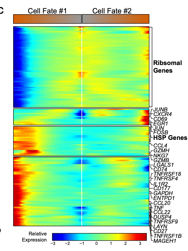
因为原文里面是恰好形成了两个细胞命运,所以可以使用 BEAM 函数, 仍然是提取具体的基因进行热图可视化:
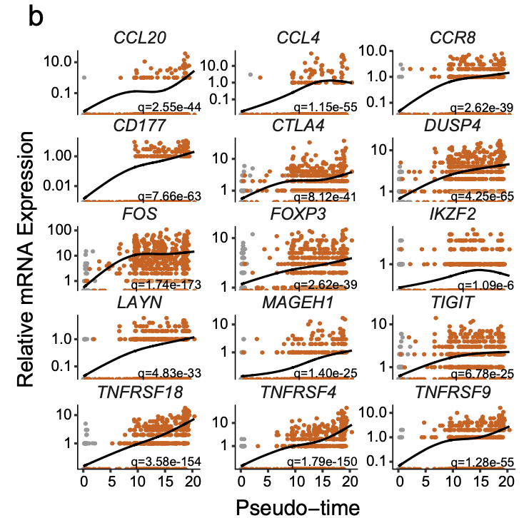
b Pseudotime projections of transcriptional changes in immune genes based on the manifold. The significance was determined based on differential testing relative to the site of origin which was also used to generate pseudotime and adjusted for multiple comparisons.
热图里面的基因其实有 多种展现方式:
c Expression heatmap of significant (q < 1e-6) genes based on branch expression analysis comparing the two TI cell fates. The genes in the heatmap were also used in the ordering of the pseudotime variable.
以及:
d Cell trajectory projections of transcriptional changes in immune genes based on the manifold. Significance based on differential testing between the first and second cell fates of TI Treg cells. “x denotes the scaled mean mRNA levels at each pole of the manifold.
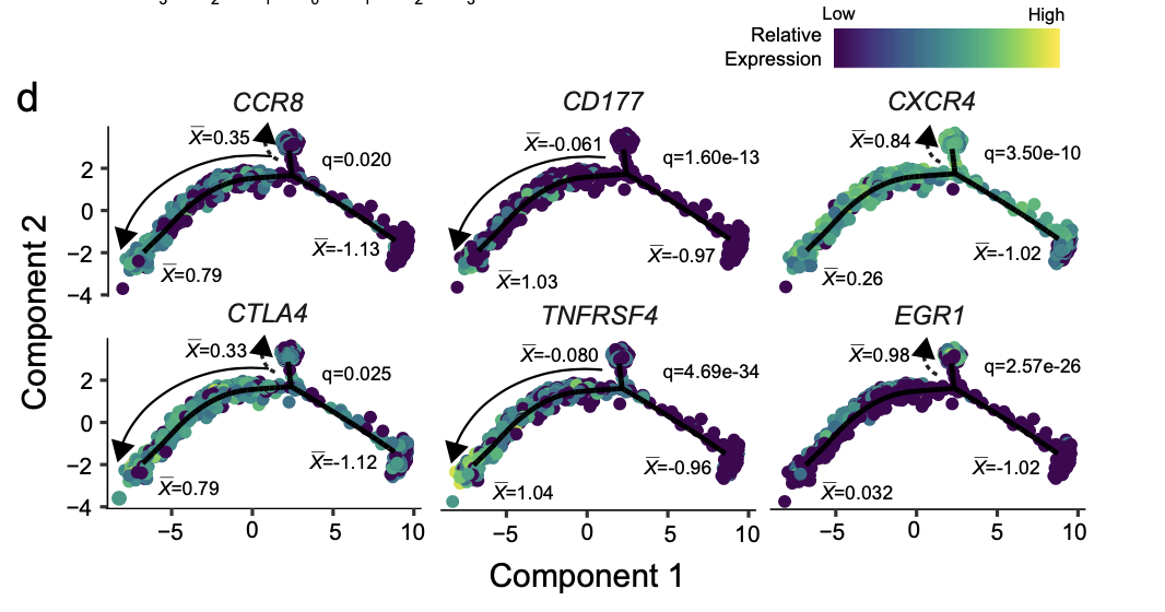
最后这个图,看起来有技术含量!