最近实验室同学在组会上分享了一篇很有意思的文章,是于 January 2021, 发表在CELL杂志的文章《Spliceosome-targeted therapies trigger an antiviral immune response in triple-negative breast cancer》,链接是:https://doi.org/10.1016/j.cell.2020.12.031
里面的GO/KEGG等生物学数据库富集注释被替换成为了 MeSH terms 的富集,而且结果还很酷炫,如下所示:
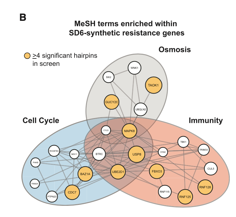
我看了看,文章里面的关于这个图的图例写的是:B) MeSH term enrichment analysis of top 50 resistance candidates. Enriched MeSH terms (FDR <0.1) grouped by related function. Node size represents number of shRNAs that significantly conferred resistance (R4 significant shRNAs highlighted in yellow).
也就是说,每一个基因都有一个值,就是它被多少个shRNAs所靶向,这个文章使用的是forward genetic screen with a short hairpin RNA (shRNA) library (18,370 shRNAs targeting 1,837 genes) ,它根据基因的shRNAs靶向情况把基因排序后,选取top50个基因,进行功能注释。
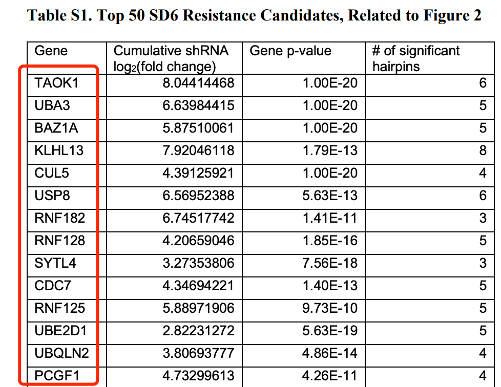
50个基因在附件
如下所示:
那么MeSH是何方神圣呢,我在公众号《 Y叔叔 YuLabSMU 2018-11-01》看到了这个:文章发表:Using meshes for MeSH term enrichment and semantic analyses,提示我们MeSH是个体量比GO还大的生物医学注释库,嘱咐总盯着GO看,有好多很好的注释库,都没什么人在用,比如MeSH就可以给大家提供不同的角度,挖掘不同的信息,不防试试。
步骤如下:
- Analysis of over-represented Medical Subject Headings (MeSH) was performed using the R package ‘‘meshes’’ (v1.8.0) (Yu, 2018) with the following parameters: MeSHDb = ‘MeSH.Hsa.eg.db’, database = ‘gene2pubmed’ and category = ‘C’.
- For Cytoscape visualization, individual genes in MeSH term categories were set as nodes and common MeSH terms as edges.
也就是说,首先你得下载和安装meshes这个包,然后使用里面的函数进行MeSH terms 的富集。
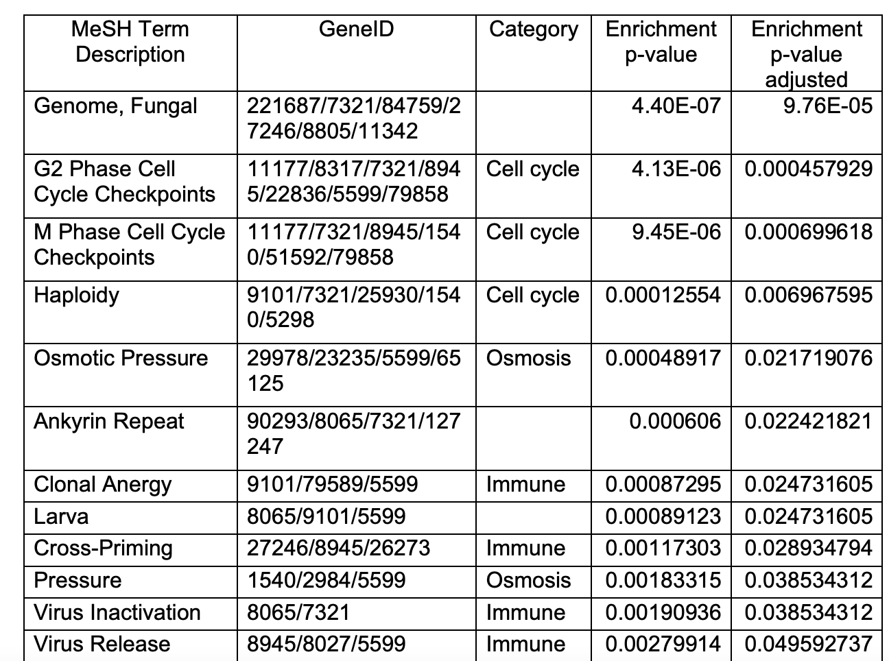
作者的MeSH富集结果也在附件
Table S2. Resistance Candidate MeSH Enrichment, Related to Figure 2
我这里就不给出来代码了,作为一个学徒作业,反正这50个基因大家可以去文章附件复制粘贴拿到,然后R包meshes呢自己摸索一下,做一个富集。我还没有来得及看这个包,不过我猜想应该是跟Y叔的其它包其它函数用法类似,大家都是成熟的生信工程师了,该学会自己看文档了!加油!
如果是普通的富集分析
就可以使用下面的代码,当然了,也是有不同的数据库可以选择:
# 自己想办法读取 文章附件的50个基因,并且针对symbol转为ENTREZID
library(ggplot2)
library(clusterProfiler)
library(org.Hs.eg.db)
# top50基因
df <- bitr(unique(top50), fromType = "SYMBOL",
 toType = c( "ENTREZID" ,'GENENAME'),
 OrgDb = org.Hs.eg.db)
head(df)
# 存储为 df 这个对象
gene_up=df$ENTREZID
enrichKK <- enrichKEGG(gene = gene_up,
 organism = 'hsa',
 #universe = gene_all,
 pvalueCutoff = 0.1,
 qvalueCutoff =0.1)
head(enrichKK)[,1:6]
dotplot(enrichKK)
enrichKK=DOSE::setReadable(enrichKK, OrgDb='org.Hs.eg.db',keyType='ENTREZID')
enrichKK
比如文章的下图,就选择了 Reactome 这个数据库:
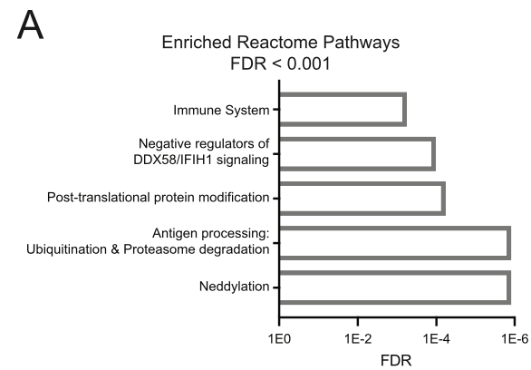
(A) Immune signaling pathway components are enriched among genes that confer resistance to spliceosome inhibition. StringDB functional enrichment analysis was performed on the top 50 SD6 resistance candidates identified by the shRNA screen. Functionally enriched Reactome Pathways with FDR < 0.001 are shown.
但是图例里面又出来了 StringDB 这个新花样!
还有一个Cytoscape的可视化
其中主要是 Table S2. Resistance Candidate MeSH Enrichment 里面的结果的解析,本身呢,Y叔的包也是提供类似的网路可视化,就是一般人想通过代码来提高颜值确实是困难,那么成熟的工具比如Cytoscape就是一个很好的选择:
至少我一般都是看了看官方文档而已:
#(3)可视化
#条带图
par(mfrow=c(2,1))
barplot(enrichKK,showCategory=20)
#气泡图
dotplot(enrichKK)
#下面的图需要映射颜色,设置和示例数据一样的geneList
# geneList = deg$logFC
# names(geneList)=deg$ENTREZID
# geneList = sort(geneList,decreasing = T)
#(3)展示top5通路的共同基因,要放大看。
#Gene-Concept Network
cnetplot(enrichKK)
做出来的图一般来说颜值都不咋地,不过仍然是强推Y叔clusterProfiler的一些可视化方法,函数列表:
- barplot
- cnetplot
- dotplot
- emapplot
- gseaplot
- goplot
- upsetplot
好几个都是以前没有介绍过的,有趣的是我准备浏览这些可视化函数的帮助文档的时候,看到了这样的话:
重点来了,Y叔特意为其包写了一本书来介绍其用法。Please go to https://yulab-smu.github.io/clusterProfiler-book/ for the full vignette.
常规的差异分析呢,基本上看我六年前的表达芯片的公共数据库挖掘系列推文即可;