生信技能树学徒培养到现在已经正式走过了一个年头,不知道这个风雨飘摇的业务还能持续多久,一个月的时间说长也不长,能在我的陪伴下走到WGCNA环节的学徒其实不多,因为要学linux和R基础,还有4大NGS组学,大量知识点其实是学徒培养结束后漫长的数据分析生涯再接再厉。
不过,恰好我的文献分析到了第19篇的时候,就是一个WGCNA文章,就安排学徒做了这个文献图表复现:
- 2019-10.预测BRCA基因功能缺陷的HRDetect基因集(逆向收费读文献)
- 2019-11 BRCA的甲基化信号分型(逆向收费读文献2019-11)赠送一篇文章思路
- 2019-12 10个单细胞转录组数据探索免疫治疗机理(逆向收费读文献2019-12)
- 2019-13 NPC的突变特性(逆向收费读文献2019-13)
- 2019-14 多组学探索卵巢癌耐药(逆向收费读文献2019-14)
- 2019-15 scTrio-seq(逆向收费读文献2019-15)
- 2019-16 小鼠TNBC模型(逆向收费读文献2019-16)
- 2019 -17肾癌单细胞(逆向收费读文献2019-17)
- 在果蝇探索PRC复合物(逆向收费读文献2019-18)
学徒写在前面
自己曾根据Jimmy老师的代码自己跑了一遍WGCNA的全流程,主要是参考:一文看懂WGCNA 分析(2019更新版)
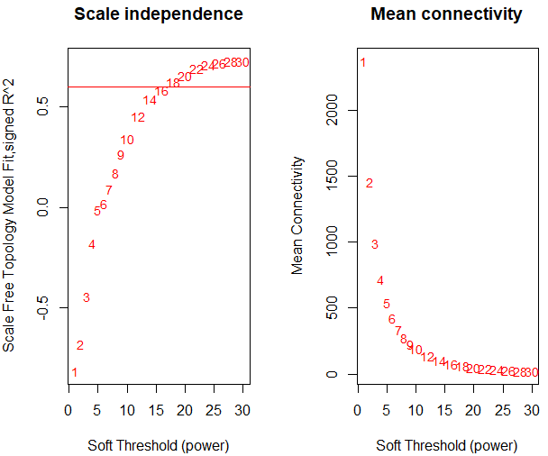
但是第一步找软阈值的时候就出现了问题,画出来 的图如下:
而我也同样是取mad最大的前5000个基因,取出这些基因形成新的表达矩阵后对矩阵做了标准化和归一化。
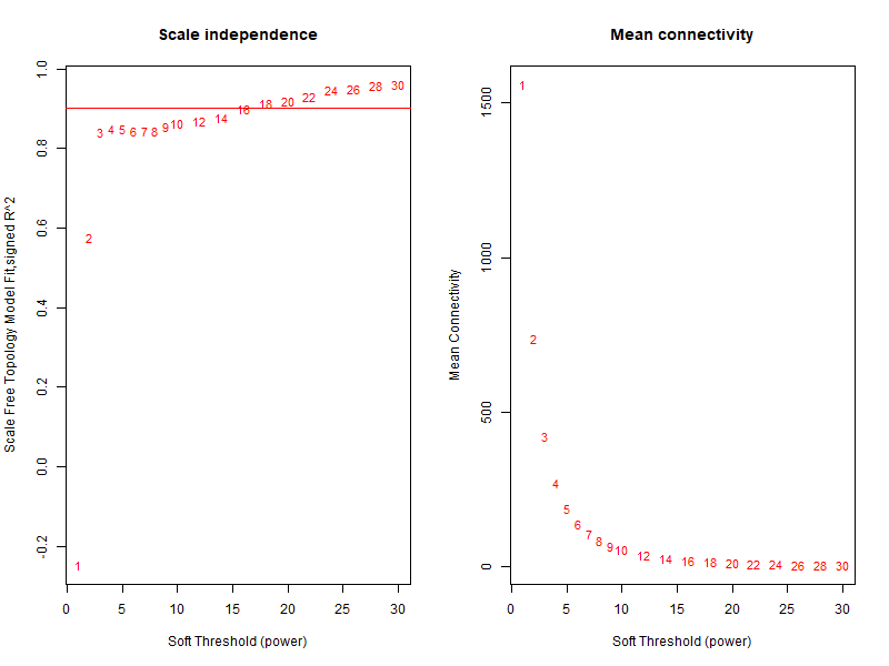
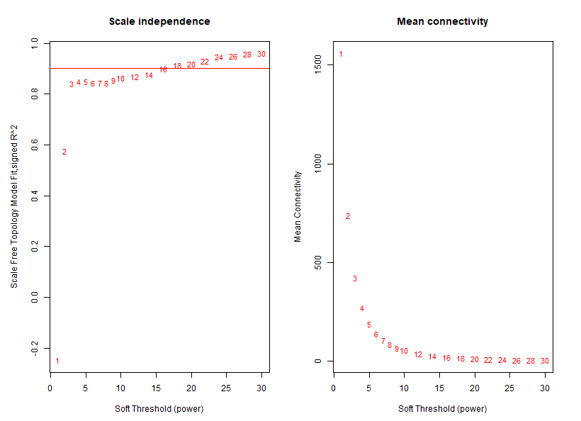
很明显,从上图可以了解到没有合格的软阈值。说明我前面的步骤肯定有地方错了。于是晚上我请教了Jimmy老师,Jimmy老师带着我从头跑了一遍,当他的这个图出来的时候我惊呆了,因为看上去和我的操作步骤是一毛一样的,但是他的图却长这样:
比较代码区别
经过比较我和Jimmy老师的代码,我们的原始counts矩阵是相同的,在做软阈值的图前唯一的区别在于:
我用counts矩阵的原始counts数据,先找mad最大的前5000个基因,再做标注化和归一化。(错误)
Jimmy老师是先对基因counts做的CPM处理,然后再去找mad最大的前5000个基因。(正确)
分析:
所谓的cpm,指得是Reads/Counts of exon model Per Million mapped reads。其计算公式是:RPM=total exon reads / mapped reads (Millions)
可以看出,cpm值是消除了基因文库大小的一个指标。
实例:有一个基因A,它在这个样本的转录组数据中被测序而且mapping到基因组了5000个的reads,我们总测序文库是50M,所以这个基因A的CPM值是 5000除以50,为100。就是把基因的reads数量根据样本测序文库来normalization 。
结论:
我先用原始的数据进行筛选,就可能会由于测序文库的不同所引起的差异而导致结果出错。所以我在比较前应该首先用CPM值来去除文库大小的影响,先做一个normalization,再去比较才有意义。
代码归纳及结果:
step1_prepare_input_data
rm(list = ls())
options(stringsAsFactors = F)
# 首先读取第一个文件做测试
a=read.table('exprSet/GSM2078124_13_Neonates_CD11c_microglia.htseq.txt.gz')
# 然后批量读取文件
tmp=do.call(cbind,lapply(list.files('exprSet/'),function(x){
 return(read.table(file.path('exprSet/',x)) )
}))
a=tmp[,seq(2,34,by=2)]
rownames(a)=tmp[,1]
library(stringr)
tmp=str_split(list.files('exprSet/'),'_',simplify = T)
colnames(a)=tmp[,1]
datTraits = data.frame(gsm=tmp[,1],
 mouse=tmp[,3],
 genetype=ifelse(grepl('CD',tmp[,4]),'pos','neg')

)
RNAseq_voom <- log(edgeR::cpm(a+1))
## 因为WGCNA针对的是基因进行聚类,而一般我们的聚类是针对样本用hclust即可,所以这个时候需要转置
WGCNA_matrix = t(RNAseq_voom[order(apply(RNAseq_voom,1,mad), decreasing = T)[1:5000],])
datExpr0 <- WGCNA_matrix ## top 5000 mad genes
datExpr <- datExpr0
datExpr[1:4,1:4]
save(datExpr,datTraits,file = 'input.Rdata')
step2_beta_value
rm(list = ls())
library(WGCNA)
load(file = 'input.Rdata')
datExpr[1:4,1:4]
if(T){
 powers = c(c(1:10), seq(from = 12, to=30, by=2))
 # Call the network topology analysis function
 sft = pickSoftThreshold(datExpr, powerVector = powers, verbose = 5)
 png("step2-beta-value.png",width = 800,height = 600)
 # Plot the results:
 ##sizeGrWindow(9, 5)
 par(mfrow = c(1,2));
 cex1 = 0.9;
 # Scale-free topology fit index as a function of the soft-thresholding power
 plot(sft$fitIndices[,1], -sign(sft$fitIndices[,3])*sft$fitIndices[,2],
 xlab="Soft Threshold (power)",ylab="Scale Free Topology Model Fit,signed R^2",type="n",
 main = paste("Scale independence"));
 text(sft$fitIndices[,1], -sign(sft$fitIndices[,3])*sft$fitIndices[,2],
 labels=powers,cex=cex1,col="red");
 # this line corresponds to using an R^2 cut-off of h
 abline(h=0.90,col="red")
 # Mean connectivity as a function of the soft-thresholding power
 plot(sft$fitIndices[,1], sft$fitIndices[,5],
 xlab="Soft Threshold (power)",ylab="Mean Connectivity", type="n",
 main = paste("Mean connectivity"))
 text(sft$fitIndices[,1], sft$fitIndices[,5], labels=powers, cex=cex1,col="red")
 dev.off()
}

sft$powerEstimate
save(sft,file = "step2_beta_value.Rdata")
step3_genes_modules
rm(list = ls())
library(WGCNA)
load(file = 'input.Rdata')
load(file = "step2_beta_value.Rdata")
##Weight co-expression network
if(T){
net = blockwiseModules(
datExpr,
power = sft$powerEstimate,
maxBlockSize = 6000,
TOMType = "unsigned", minModuleSize = 30,
reassignThreshold = 0, mergeCutHeight = 0.25,
numericLabels = TRUE, pamRespectsDendro = FALSE,
saveTOMs = F,
verbose = 3
)
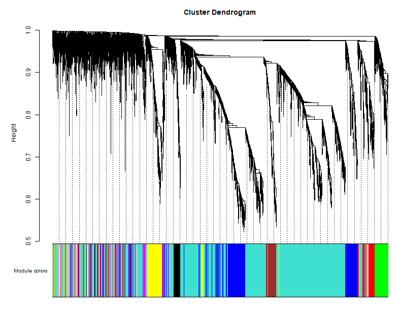
table(net$colors)
}
##模块可视化
if(T){
# Convert labels to colors for plotting
mergedColors = labels2colors(net$colors)
table(mergedColors)
moduleColors=mergedColors
# Plot the dendrogram and the module colors underneath
png("step3-genes-modules.png",width = 800,height = 600)
plotDendroAndColors(net$dendrograms[[1]], mergedColors[net$blockGenes[[1]]],
"Module colors",
dendroLabels = FALSE, hang = 0.03,
addGuide = TRUE, guideHang = 0.05)
dev.off()
## assign all of the gene to their corresponding module
## hclust for the genes.
}
if(T){
#明确样本数和基因
nGenes = ncol(datExpr)
nSamples = nrow(datExpr)
#首先针对样本做个系统聚类
datExpr_tree<-hclust(dist(datExpr), method = "average")
#针对前面构造的样品矩阵添加对应颜色
sample_colors1 <- numbers2colors(as.numeric(factor(datTraits$mouse)),
colors = c("green","blue","red" ),signed = FALSE)
sample_colors2 <- numbers2colors(as.numeric(factor(datTraits$genetype)),
colors = c('yellow','black'),signed = FALSE)
ssss=as.matrix( data.frame(mouse=sample_colors1,
gt=sample_colors2))
par(mar = c(1,4,3,1),cex=0.8)
png("sample-subtype-cluster.png",width = 800,height = 600)
plotDendroAndColors(datExpr_tree, ssss,
groupLabels = colnames(sample),
cex.dendroLabels = 0.8,
marAll = c(1, 4, 3, 1),
cex.rowText = 0.01,
main = "Sample dendrogram and trait heatmap")
dev.off()
}
save(net,moduleColors,file = "step3_genes_modules.Rdata")
我们得到了11个模块,而作者得到了8个模块。
模块可视化展示:
样本表型聚类:
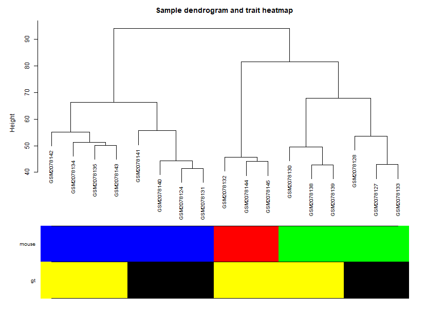
可以看到,这幅图是非常符合认知的。
step4_Module_trait_relationships
rm(list = ls())
library(WGCNA)
load(file = 'input.Rdata')
load(file = "step2_beta_value.Rdata")
load(file = "step3_genes_modules.Rdata")

table(datTraits$mouse)
table(datTraits[,2:3])
if(T){
 nGenes = ncol(datExpr)
 nSamples = nrow(datExpr)
 design1=model.matrix(~0+ datTraits$mouse)
 design2=model.matrix(~0+ datTraits$genetype)
 EAEpos=sign(datTraits[,2]=='EAE' & datTraits[,3]=='pos')
 Neonatespos=sign(datTraits[,2]=='Neonates' & datTraits[,3]=='pos')
 design=cbind(design1,design2,EAEpos,Neonatespos)
 colnames(design)=c('EAE','Neonates','ctrl','neg','pos','EAE_POS','NEO_POS')
 moduleColors <- labels2colors(net$colors)
 # Recalculate MEs with color labels
 MEs0 = moduleEigengenes(datExpr, moduleColors)$eigengenes
 MEs = orderMEs(MEs0); ##不同颜色的模块的ME值矩 (样本vs模块)
 moduleTraitCor = cor(MEs, design , use = "p");
 moduleTraitPvalue = corPvalueStudent(moduleTraitCor, nSamples)

 sizeGrWindow(10,6)
 # Will display correlations and their p-values
 textMatrix = paste(signif(moduleTraitCor, 2), "\n(",
 signif(moduleTraitPvalue, 1), ")", sep = "");
 dim(textMatrix) = dim(moduleTraitCor)
 png("step4-Module-trait-relationships.png",width = 800,height = 1200,res = 120)
 par(mar = c(6, 8.5, 3, 3));
 # Display the correlation values within a heatmap plot
 labeledHeatmap(Matrix = moduleTraitCor,
 xLabels = colnames(design),
 yLabels = names(MEs),
 ySymbols = names(MEs),
 colorLabels = FALSE,
 colors = greenWhiteRed(50),
 textMatrix = textMatrix,
 setStdMargins = FALSE,
 cex.text = 0.5,
 zlim = c(-1,1),
 main = paste("Module-trait relationships"))
 dev.off()
 # 除了上面的热图展现形状与基因模块的相关性外
 # 还可以是条形图,但是只能是指定某个形状
 # 或者自己循环一下批量出图。
 if(F){
 png("step4-Module-single_trait-relationships.png",width = 800,height = 1200,res = 120)
 par(mar = c(6, 8.5, 3, 3));
 layout(matrix(c(rep(1,2),rep(2,2),rep(3,2),rep(4,2),rep(5,2),rep(6,2),rep(7,2)),byrow = T,nrow = 7))
 for (i in 1:7) {
 y = as.data.frame(design[,i]);
 GS1=as.numeric(cor(y,datExpr, use="p"))
 GeneSignificance=abs(GS1)
 # Next module significance is defined as average gene significance.
 ModuleSignificance=tapply(GeneSignificance,
 moduleColors, mean, na.rm=T)
 #sizeGrWindow(8,7)
 #par(mfrow = c(1,1))
 # 如果模块太多,下面的展示就不友好
 # 不过,我们可以自定义出图。
 plotModuleSignificance(GeneSignificance,moduleColors)
 }
 }
 save(design,file = "step4_design.Rdata")
}
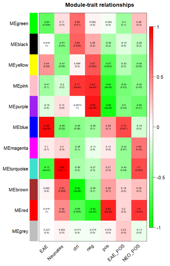
重复所得到的模块与表型之间的相关性图:
原文中的表型和找到的模块之间的相关性图:
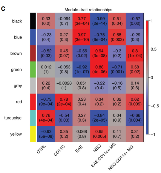
看上去有些相似,例如文中提到EAE和NEO在black ,blue , brown ,green 这四个模块之间是正好相反的关系,而在我们的关系热图中也存在这种关系,只不过我们的模块分的和作者分是有差异而已,因为大家做WGCNA的input矩阵的基因数量不一样,而且原文使用RPKM那样的值,我们使用的是cpm这样的值。
要想验证到底我们做的对不对,理所当然的就想到了对每个模块进行GO注释,看是否与作者GO注释后的模块功能相同即可。
step5_Annotation_Module_GO_BP:
rm(list = ls())
library(WGCNA)
load(file = 'input.Rdata')
load(file = "step2_beta_value.Rdata")
load(file = "step3_genes_modules.Rdata")
load(file = "step4_design.Rdata")

table(moduleColors)
group_g=data.frame(gene=colnames(datExpr),
 group=moduleColors)
save(group_g,file='step5_Annotation_Module_GO_BP_group_g.Rdata')

rm(list = ls())
load(file='step5_Annotation_Module_GO_BP_group_g.Rdata')
library(clusterProfiler)
# Convert gene ID into entrez genes
tmp <- bitr(group_g$gene, fromType="ENSEMBL",
 toType="ENTREZID",
 OrgDb="org.Mm.eg.db")

de_gene_clusters=merge(tmp,group_g,by.x='ENSEMBL',by.y='gene')
table(de_gene_clusters$group)

#list_de_gene_clusters <- split(de_gene_clusters$ENTREZID,de_gene_clusters$group)

# Run full GO enrichment test
formula_res <- compareCluster(
 ENTREZID~group,
 data=de_gene_clusters,
 fun="enrichGO",
 OrgDb="org.Mm.eg.db",
 ont = "BP",
 pAdjustMethod = "BH",
 pvalueCutoff = 0.01,
 qvalueCutoff = 0.05
)

# Run GO enrichment test and merge terms
# that are close to each other to remove result redundancy
lineage1_ego <- simplify(
 formula_res,
 cutoff=0.5,
 by="p.adjust",
 select_fun=min
)

# Plot both analysis results
#pdf('female_compared_GO_term_DE_cluster.pdf',width = 11,height = 6)
#dotplot(formula_res, showCategory=5)
#dev.off()
pdf('Microglia_compared_GO_term_DE_cluster_simplified.pdf',width = 13,height = 8)
dotplot(lineage1_ego, showCategory=5)
dev.off()

# Save results
#write.csv(formula_res@compareClusterResult,
# file="Microglia_compared_GO_term_DE_cluster.csv")
write.csv(lineage1_ego@compareClusterResult,
 file="Microglia_compared_GO_term_DE_cluster_simplified.csv")

## 扩展:enric其它数据库,KEGG, RECTOME, GO(CC,MF)
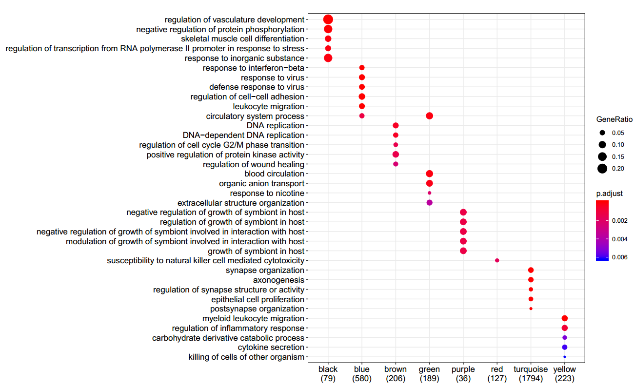
自己得到的GO注释:
文中作者的GO注释结果:
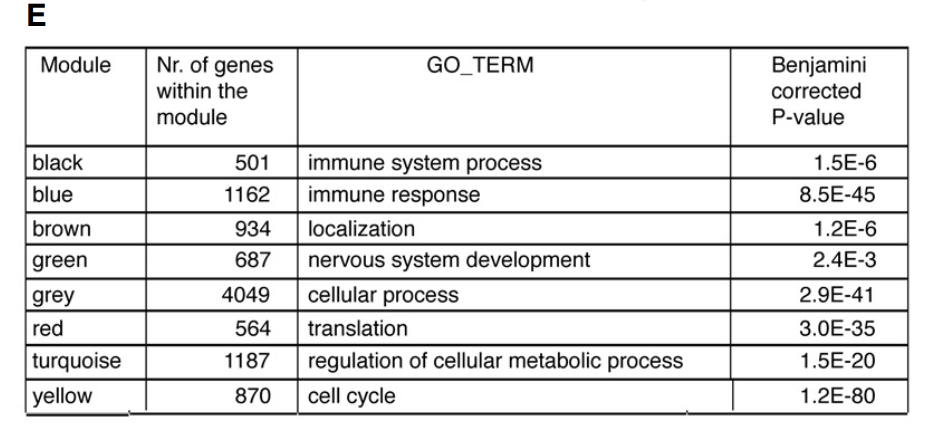
首先对文章中模块的GO进行归纳:
1.The ME of the yellow module was negatively correlated with “control” (-0.93; downregulated) and positively with “neonatal” (between 0.068 and 0.65). The top gene ontology (GO) enrichment category associated with the yellow module was the “cell cycle” term (Fig 3E). This suggested that microglia from neonates more abundantly expressed cell cycle genes.
黄色模块与control组负相关下调,而与neonatal组正相关,其GO主要富集在cell cycle,表明新生的小胶质细胞主要表达cell cycle增殖相关基因。
2.the turquoise module was negatively correlated with “neonatal” variable (-0.84) and positively correlated with “control” (0.76). This module was enriched for GO term “regulation of cellular metabolic process “
绿松色模块和neonatal组负相关,与control组正相关,其GO主要富集在regulation of cellular metabolic process,与细胞代谢调节相关。
3.The red module was not only negatively correlated with the “control”, but also positively correlated with the “CD11c” variable (-0.73 versus 0.78). This suggested an activation-related increase in expression, which is more pronounced in CD11c positive microglia. This red module was enriched for a “translation” GO term (Fig 3E), suggesting that neonatal and EAE microglia and in particular CD11c microglia were more translationally active
红色模块和control负相关,和CD11c组正相关,GO中与翻译相关。表明neonatal and EAE 组,尤其是CD11c 组中翻译更加活跃
4.four modules (black, blue, green, and brown) showed clear opposite correlations with the “EAE” and “neonatal” variables (Fig 3C). Where the blue and black modules increased their expression in EAE microglia, the expression of these modules was reduced in neonatal microglia
black, blue, green, and brown四个模块之间在EAE和neonatal组表达情况正好相反。black, blue模块在EAE 里高表达,green, brown在neonatal 组中高表达。
The blue and black modules were enriched for “immune system process” and “immune response” categories. In contrast, ME values of the brown and green modules negatively correlated
black, blue主要和“immune system process” and “immune response” 相关,也就是主要是免疫相关的。
brown and green主要和免疫是负相关的。
The green and brown modules were enriched for “nervous system development” and “localization” GO terms, respectively .
green 主要和神经系统的发育相关,brown主要和定位。
the brown module also significantly correlated with the CD11c+ neonatal microglia variable, suggesting that the CD11c+ population in neonatal brains most abundantly expressed genes related to the “localization” GO term
brown 模块与CD11c+ neonatal组也显著相关,表明CD11c+ neonatal与定位相关。
Taken together, these findings suggest that microglia under EAE conditions became immune-activated, while microglia in neonatal brains displayed a CNS-supportive and neurogenic phenotype.
结论:
EAE 组主要是免疫激活,neonatal 组主要是免疫支持和神经形成的表型。
自己重复的结果:
1.EAE组主要在blue模块中呈现正相关,而blue模块主要是”defense response to virus “相关或者”leukocyte migration “,也就是和免疫相关的一些表型。与文章中免疫反应相符合。
2.neonatal 组主要和turquoise 模块正相关,而turquoise 模块主要是”synapse organization “以及”epithelial cell proliferation “,也就是主要和突触形成和上皮细胞增殖相关的表型,且这个模块和control组也是呈现负相关,和文章中”cell cycle“相符。
3.blue模块和turquoise 模块在EAE组和neonatal 组也是呈现出相反的表现,和文章中的相符。
4.其中pink基因模块与control组正相关,和neonatal组负相关,与文中的”turquoise module“相符,但是在做基因ID转换的过程中5000个基因损失了1147个(22.94%),这些没有找到相匹配的基因ID而被去除了。
5.red模块和control负相关,和CD11c组正相关,其GO主要富集在”susceptibility to natural killer cell mediated cytotoxicity “,也就是和免疫相关。与原文不符。原文中的这个模块是”red module“,其相关的GO是“translation”
6.不知道为什么control组的重要pink基因模块被删除了???
可能原因:
1.Co-expression networks were generated for 12,691 genes of the transcriptome dataset. 作者文中用了12,691 genes来做WGCNA分析,而我们只用了mad的top5000个基因。并且最后在做基因注释的过程中又损失了1147个没有找到ENTREZID的的基因。
学徒写在最后
首先感谢Jimmy老师的教程和代码,基本上只要跟着一步步学下来,肯定能复现漂亮的图,但是其中的原理需要自己仔细研究和领会。
另外,非常感谢Jimmy老师对我耐心的指导和引导,当我遇到问题时,能一下了解我遇到的代码问题在哪里,比我百度谷歌半天教程都有用。
我写在最后
大家如果感兴趣这篇文章,发表于2017年11月,标题是 A novel microglial subset plays a key role in myelinogenesis in developing brain , 可以看今天生信技能树公众号次页的推文详细学习。
能遇到一个能吃苦,天资还可以的学徒其实很不容易,后面还有3篇教程来自于此学徒,欢迎大家持续关注哈。