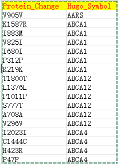
| Hugo_Symbol | HUGO symbol for the gene | TP53 |
| Protein_Change | Amino acid change | V600E |
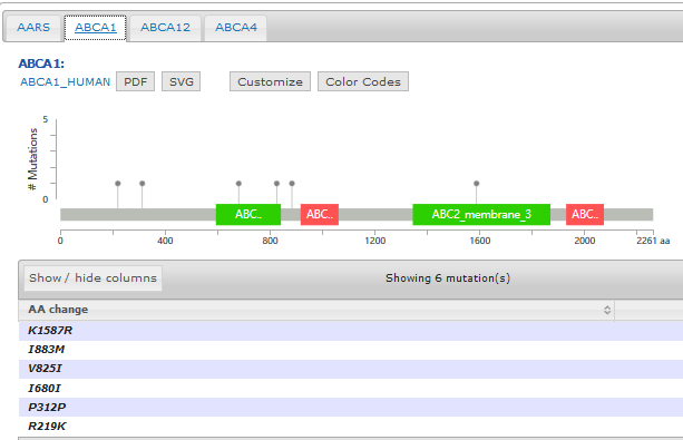
- Support mutation data with annotated protein effects
- Mutation diagram/lollipop view
- Mutation table view
- 3D structure view if available
Pfam provides an online tool to not only generate the domain information in JSON format, but to draw the lollipop diagram using javascript as well. They have more information here: http://pfam.xfam.org/help#tabview=tab9
IMHO, not as pretty as cBioPortal's but it gets you close to a solution.
EDIT / SHAMELESS PLUG: After seeing the data available and how easy it'd be, I made my own quick tool to fetch the data and draw the diagram for me in a style similar to cBioPortal - feel free to fork it and add features: https://github.com/pbnjay/lollipops
Example output (w/ labels per the comments)
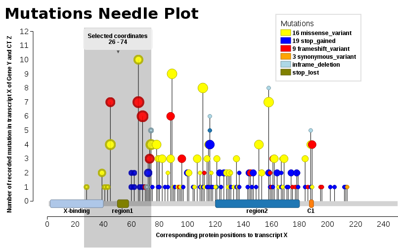
We found ourselves in the same need, we wanted such a plot (JavaScript). Thus, I add our solution, Mutations Needle Plot. The library creates an SVG image (with D3), which then may be downloaded.
- Live examples are found at BioJS: http://registry.biojs.net/client/#/detail/muts-needle-plot
- Code is available at GitHub: https://github.com/bbglab/muts-needle-plot
- And it is also a npm-package: https://www.npmjs.com/package/muts-needle-plot
You will npm in order to be able to install & run the library.
Examples may be found in the snippets folder or also the index.html - The one displayed here below