马拉松课程学习群有学员提问,她参考了一个自定义函数修改pheatmap热图,但是一直报错。其实是因为她选取的基因超出了热图里面的全部基因,但是如果辩证思维不够,就会怀疑函数本身的问题。
我给学员了一个很简单的例子, 就是自己创造一个数据,然后使用 https://github.com/ajwilk/2020_Wilk_COVID 里面的自定义函数, 全部的代码如下所示:
df=as.data.frame(matrix(rnorm(2600),100))
library(pheatmap)
pheatmap(df)
rownames(df)
add.flag <- function(pheatmap,
kept.labels,
repel.degree) {
# repel.degree = number within [0, 1], which controls how much
# space to allocate for repelling labels.
## repel.degree = 0: spread out labels over existing range of kept labels
## repel.degree = 1: spread out labels over the full y-axis
heatmap <- pheatmap$gtable
new.label <- heatmap$grobs[[which(heatmap$layout$name == "row_names")]]
# keep only labels in kept.labels, replace the rest with ""
new.label$label <- ifelse(new.label$label %in% kept.labels,
new.label$label, "")
# calculate evenly spaced out y-axis positions
repelled.y <- function(d, d.select, k = repel.degree){
# d = vector of distances for labels
# d.select = vector of T/F for which labels are significant
# recursive function to get current label positions
# (note the unit is "npc" for all components of each distance)
strip.npc <- function(dd){
if(!"unit.arithmetic" %in% class(dd)) {
return(as.numeric(dd))
}
d1 <- strip.npc(dd$arg1)
d2 <- strip.npc(dd$arg2)
fn <- dd$fname
return(lazyeval::lazy_eval(paste(d1, fn, d2)))
}
full.range <- sapply(seq_along(d), function(i) strip.npc(d[i]))
selected.range <- sapply(seq_along(d[d.select]), function(i) strip.npc(d[d.select][i]))
return(unit(seq(from = max(selected.range) + k*(max(full.range) - max(selected.range)),
to = min(selected.range) - k*(min(selected.range) - min(full.range)),
length.out = sum(d.select)),
"npc"))
}
new.y.positions <- repelled.y(new.label$y,
d.select = new.label$label != "")
new.flag <- segmentsGrob(x0 = new.label$x,
x1 = new.label$x + unit(0.15, "npc"),
y0 = new.label$y[new.label$label != ""],
y1 = new.y.positions)
# shift position for selected labels
new.label$x <- new.label$x + unit(0.2, "npc")
new.label$y[new.label$label != ""] <- new.y.positions
# add flag to heatmap
heatmap <- gtable::gtable_add_grob(x = heatmap,
grobs = new.flag,
t = 4,
l = 4
)
# replace label positions in heatmap
heatmap$grobs[[which(heatmap$layout$name == "row_names")]] <- new.label
# plot result
grid.newpage()
grid.draw(heatmap)
# return a copy of the heatmap invisibly
invisible(heatmap)
}
library(grid)
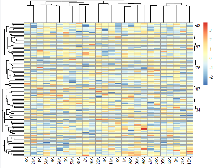
(gene_name<-sample(rownames(df),5))
p1<-pheatmap(df)
add.flag(p1,
kept.labels = gene_name,
repel.degree = 0.2)
可以看到, 自己的定义的一个随机数组成的表达量矩阵被绘制了热图,而且自己随机挑选的5个行名也被重点显示出来了:
如果是以 airway 这样的表达量矩阵作为示例,你会发现这个自定义你的pheatmap热图小技巧超级有用,比如
suppressPackageStartupMessages( library( "airway" ) )
library("airway")
data(airway)
ensembl_matrix=assay(airway)
ensembl_matrix[1:4,1:4]
dim(ensembl_matrix)
library(AnnoProbe)
gs=annoGene(rownames(ensembl_matrix),'ENSEMBL','human')
head(gs)
as.data.frame(tail(sort(table(gs$biotypes))))
pd_genes=gs[gs$biotypes=='protein_coding',]
pd_matrix=ensembl_matrix[rownames(ensembl_matrix) %in% pd_genes$ENSEMBL,]
rownames(pd_matrix)=pd_genes[match(rownames(pd_matrix),pd_genes$ENSEMBL),1]
pd_matrix[1:4,1:4]
pd_matrix=log2(edgeR::cpm(pd_matrix)+1)

dat=pd_matrix
cg=names(tail(sort(apply(dat,1,sd)),1000))#apply按行('1'是按行取,'2'是按列取)取每一行的方差,从小到大排序,取最大的1000个
library(pheatmap)
pheatmap(dat[cg,],show_colnames =F,show_rownames = F) #对那些提取出来的1000个基因所在的每一行取出,组合起来为一个新的表达矩阵
n=t(scale(t(dat[cg,]))) # 'scale'可以对log-ratio数值进行归一化
n[n>2]=2
n[n< -2]= -2
n[1:4,1:4]
pheatmap(n,
 show_colnames =F,
 show_rownames = T)
出图会非常丑:
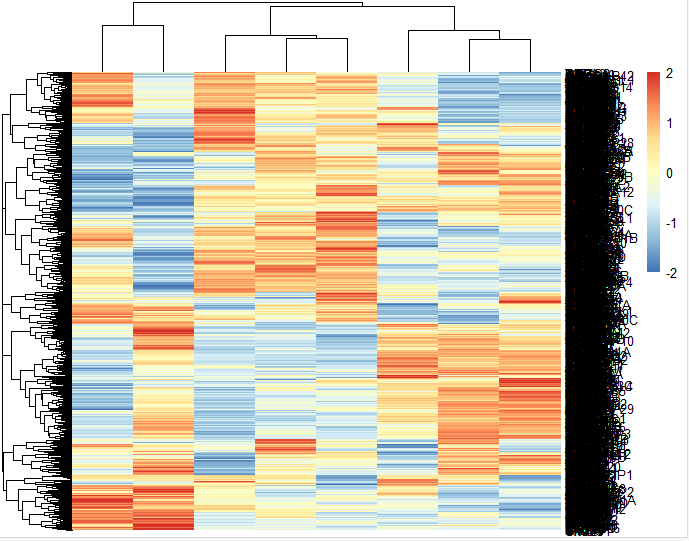
因为我们挑选了1000个基因,无论你如何调整这个图的比例大小,都是无济于事。但是如果你使用我们上面介绍的技巧:
library(grid)
(gene_name<-sample(rownames(n),5))
p1<-pheatmap(n)
add.flag(p1,
 kept.labels = gene_name,
 repel.degree = 0.2)
见证奇迹的时刻:
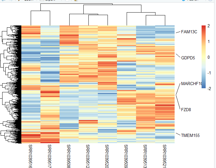
你重点想展示的基因,一目了然。