前面的教程:混合到同一个10X样品里面的多个细胞系如何注释,我们提到了可以使用细胞系的表达量矩阵去跟细胞亚群表达量矩阵进行相关性计算。
就有粉丝提问,把单细胞亚群使用 AverageExpression 函数做成为了亚群矩阵,是不是忽略了单细胞亚群的异质性呢?毕竟每个单细胞亚群背后都是成百上千个具体的细胞啊。代码如下所示:
rm(list = ls())
library(SingleR)
library(Seurat)
library(ggplot2)

# 读入scRNA数据 -------
scRNA <- readRDS("../step1_聚类/sce_all.Rds")
table(Idents(scRNA) )
Idents(scRNA) <- "RNA_snn_res.0.2"
table(Idents(scRNA) )
可以看到,我们的8个细胞亚群,确实是都是有几百个细胞的,使用 AverageExpression 函数会被融合成为了一个样品:
> table(Idents(scRNA) )

0 1 2 3 4 5 6 7
976 881 511 510 493 487 440 316
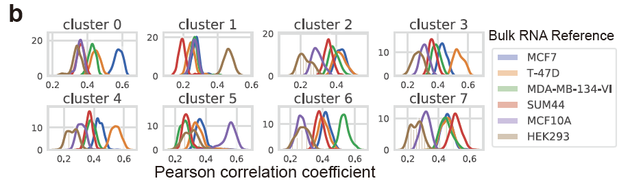
而且原文很明显使用的是具体的单细胞亚群里面的全部细胞去和各个细胞系进行计算相关性,然后绘制密度图:
其实也很容易实现啊!
首先拿到全部的细胞系和全部的具体的每个单细胞的表达相关性矩阵(Pearson correlation coefficient),代码如下:
sce <- readRDS("../step1_聚类/sce_all.Rds")
load(file = 'for_cor.Rdata')
head(reference)
head(query)
cg=sce@assays$RNA@var.features
ids=intersect(rownames(reference),cg)
ids=rownames(reference)
ct=sce@assays$RNA@data[ids,]
ct[1:4,1:4]
# 这个时候不能使用 AverageExpression 函数把表达量矩阵融合

table(sce$RNA_snn_res.0.2)
data_merged=cbind(ct,reference)
str(data_merged)
tmp=apply(data_merged, 2,as.numeric)
colnames(tmp)=colnames(data_merged)
rownames(tmp)=rownames(data_merged)
cor_df=cor(tmp)
cor_df[1:4,1:4]
dim(cor_df)
dim(ct)
tt_df = cor_df[1:4614,4615:ncol(cor_df)]
tt_df=as.data.frame(tt_df)
tt_df$clusterID = sce$RNA_snn_res.0.2
head(tt_df)
colnames(tt_df)
colnames(tt_df)[c(1:6 )]

data=tt_df
如下所示,每个具体的单细胞,都有各自对应的多个细胞系的表达相关性矩阵(Pearson correlation coefficient),:
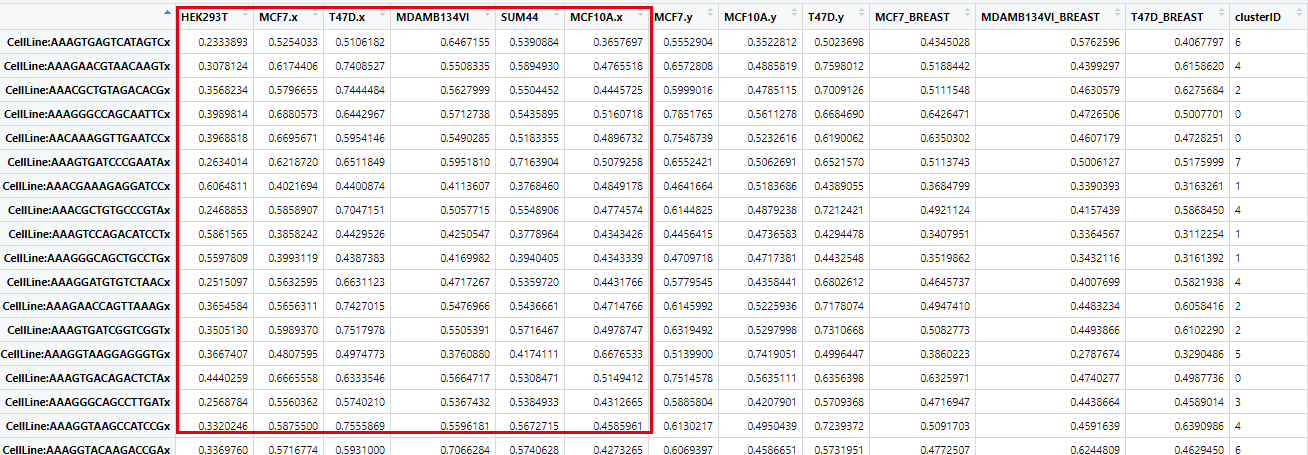
然后就可以对这个 Pearson correlation coefficient 矩阵,进行密度图可视化,构造一个函数:
plot_density <- function(clusterID){
 samplenames <- colnames(data)[c(1:6)]
 col <- c('#1b9e77','#d95f02','#7570b3','#e7298a','#66a61e','#e6ab02')
 plot(density(data[which(data$clusterID == clusterID),1]),
 xlim = c(0.2,0.8),ylim = c(0, 20), lwd=5,
 las=2, main="", xlab="", col=col[1])
 title(main=paste0("cluster", clusterID), xlab="Pearson correlation coefficient")
 den <- density(data[which(data$clusterID == clusterID),2])
 lines(den$x, den$y, col=col[2], lwd=5)
 den <- density(data[which(data$clusterID == clusterID),3])
 lines(den$x, den$y, col=col[3], lwd=5)
 den <- density(data[which(data$clusterID == clusterID),4])
 lines(den$x, den$y, col=col[4], lwd=5)
 den <- density(data[which(data$clusterID == clusterID),5])
 lines(den$x, den$y, col=col[5], lwd=5)
 den <- density(data[which(data$clusterID == clusterID),6])
 lines(den$x, den$y, col=col[6], lwd=5)
 # legend("right", samplenames, text.col=col, bty="n")
}
使用上面的 plot_density 函数 先看一个细胞亚群里面的全部的细胞的相关性系数的密度图:
#画图例并与上图手动合并
col <- c('#1b9e77','#d95f02','#7570b3','#e7298a','#66a61e','#e6ab02')
samplenames <- colnames(data)[ 1:6]
plot_density(clusterID = 0)
legend("right", samplenames, text.col=col, bty="n")
如下所示:
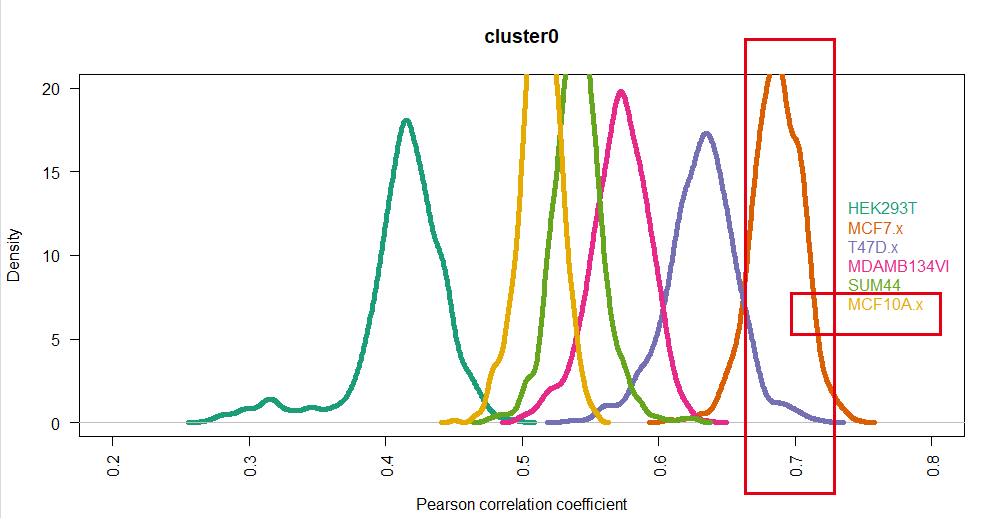
可以看到,很清晰的显示了这个cluster0的细胞亚群就是MCF7(我截图的时候,眼神有点飘,大家忽略哈)
我们前面步骤的 混合到同一个10X样品里面的多个细胞系如何注释,手动注释如下:
# st ep4. 手动注释细胞类型------
# cluster0 MCF7
# cluster1 HEK293
# cluster2 T47D
# cluster3 BCK4 # 排除法
# cluster4 T47D
# cluster5 MCF10A
# cluster6 MM134
# cluster7 SUM44
基本上是一致的!
然后画全部的细胞亚群:
pdf(file = "density_cluster.pdf", width = 16, height = 6)
par(mfrow=c(2,4))
plot_density(clusterID = 0)
plot_density(clusterID = 1)
plot_density(clusterID = 2)
plot_density(clusterID = 3)
plot_density(clusterID = 4)
plot_density(clusterID = 5)
plot_density(clusterID = 6)
plot_density(clusterID = 7)
dev.off()
如下所示,基本上跟前面的步骤是一样的结果啦;
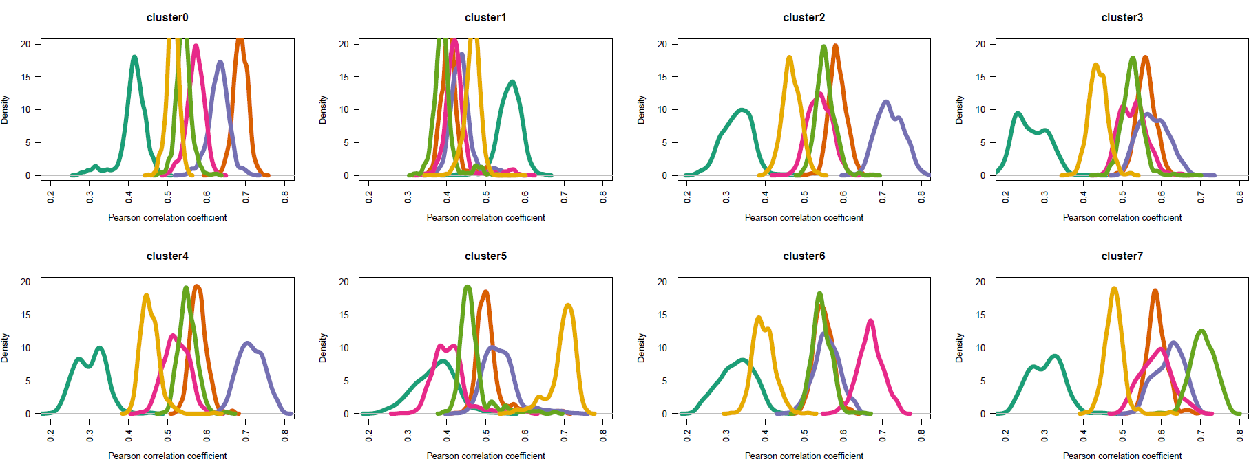
手动注释如下:
# st ep4. 手动注释细胞类型------
# cluster0 MCF7
# cluster1 HEK293
# cluster2 T47D
# cluster3 BCK4 # 排除法
# cluster4 T47D
# cluster5 MCF10A
# cluster6 MM134
# cluster7 SUM44
基本上是一致的!
也可以使用小提琴图来展示:
# 二、可视化之——小提琴图 -------
# 1.数据
data_used <- data[,c(1:6,13)]
# 宽变长
data_used <- tidyr::gather(data_used, key = "celltype", value = "avg_expr", -clusterID)
head(data_used)
# 2.绘图
library(ggplot2)
p <- ggplot(data_used, aes(x = clusterID, y = avg_expr, fill = celltype)) +
 geom_violin() +
 theme(plot.margin=margin(t = 0, b = 0, unit="pt"),
 plot.subtitle = element_text(family = "serif", colour = "gray0"),
 plot.background = element_rect(fill = "aliceblue"),
 plot.title = element_text(family = "serif", hjust = 1, vjust = 0, colour = "forestgreen"),
 # 背景板
 panel.grid.minor = element_line(linetype = "blank"),
 panel.grid.major.y = element_line(colour = "coral", linetype = "dashed"),
 panel.background = element_rect(fill = "white"),
 # 坐标轴标题
 axis.title.x = element_text(family = "serif",face = "bold",colour = "chocolate4", hjust = 0.5, vjust = 0),
 axis.title.y = element_text(family = "serif",face = "bold",colour = "chocolate4", hjust = 0.5, vjust = 0.5),
 # 图例
 legend.title = element_text(hjust = 0.55,face = "bold", colour = "chocolate4",family = "serif"),
 legend.direction = "vertical",
 legend.text = element_text(family = "serif"),
 legend.key = element_rect(fill = "aliceblue"),
 legend.background = element_rect(fill = "aliceblue")) +
 facet_wrap(vars(clusterID), nrow = 2, scales = "free")
p
ggsave(p, filename = "violin.pdf", width = 14, height = 6)
如下所示:
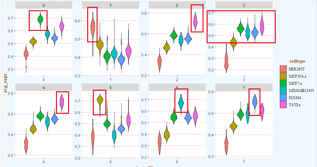
手动注释如下:
# st ep4. 手动注释细胞类型------
# cluster0 MCF7
# cluster1 HEK293
# cluster2 T47D
# cluster3 BCK4 # 排除法
# cluster4 T47D
# cluster5 MCF10A
# cluster6 MM134
# cluster7 SUM44
基本上是一致的!(看到这里,你有没有觉得这个流程跟某个软件的算法类似呢?)