差异分析,大家都喜欢两个分组的比较,但实际科研项目,往往是比这复杂,多达十几个甚至几十个分组也不稀奇。昨天的教程:多分组的差异分析只需要合理设置design矩阵即可,我们展示了无论多少个分组,都可以很方便的进行差异分析。
但是多个分组的差异分析结果其实展现起来会有点考验大家的创造力,这一点,哪怕是CNS级别的文章也不见得做的很好,比如文章《A pathway coordinated by DELE1 relays mitochondrial stress to the cytosol》,链接是:https://www.nature.com/articles/s41586-020-2076-4
其文章和附件,你能数一下到底有多少个火山图吗?
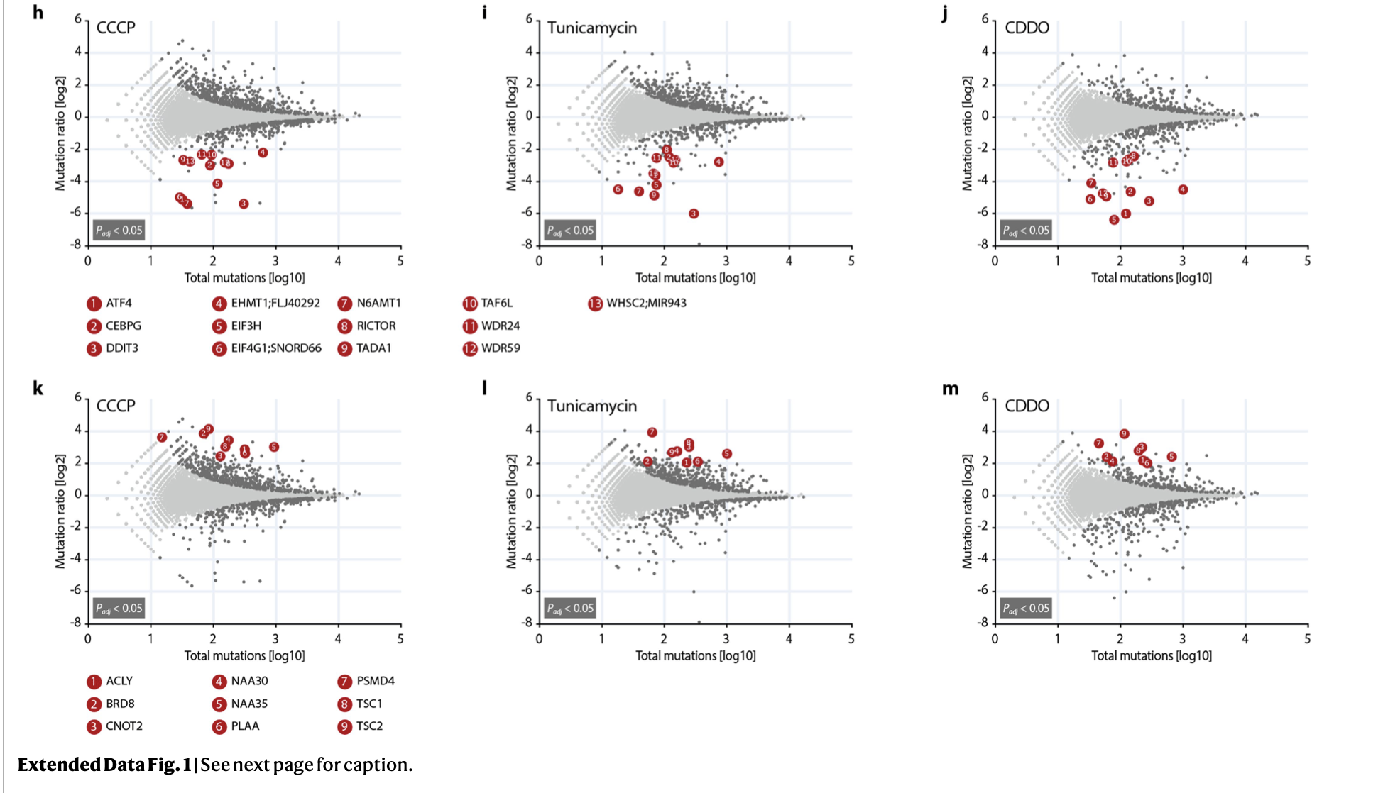
这个文章提供原始的测序数据:. Deep-sequencing raw data (genome-wide genetic screens and RNA-seq) have been deposited in the NCBI Sequence Read Archive under accession number PRJNA559719.
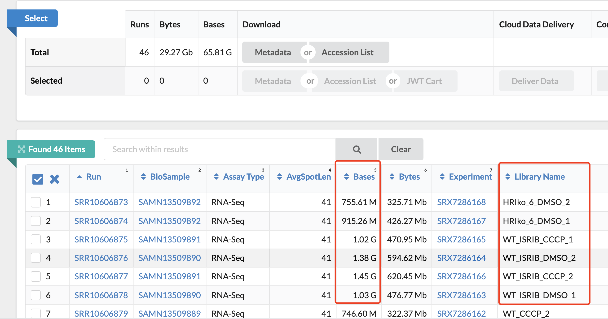
但是好奇怪,附件给出来的差异分析结果其实并没有那么多,Supplementary Tables 6-10: Results of RNAseq analysis upon CCCP treatment:
- HAP1 wild-type cells (Supplementary Table 6),
- wild-type cells co-treated with ISRIB (Supplementary Table 7),
- HRI knockout cells (Supplementary Table 8),
- DELE1 knockout cells (Supplementary Table 9),
- DELE1 knockout cells stably reconstituted with DELE1 (Supplementary Table 10)
如果仅仅是五次差异分析结果,其实把全部的火山图,热图一股脑展现也不是不可以。但是如果是几十个差异分析结果,最好是有一个精炼一点的展现方式啦。比如文章《Combining gene mutation with gene expression data improves outcome prediction in myelodysplastic syndromes》的方法就值得借鉴,原作者效果图如下所示
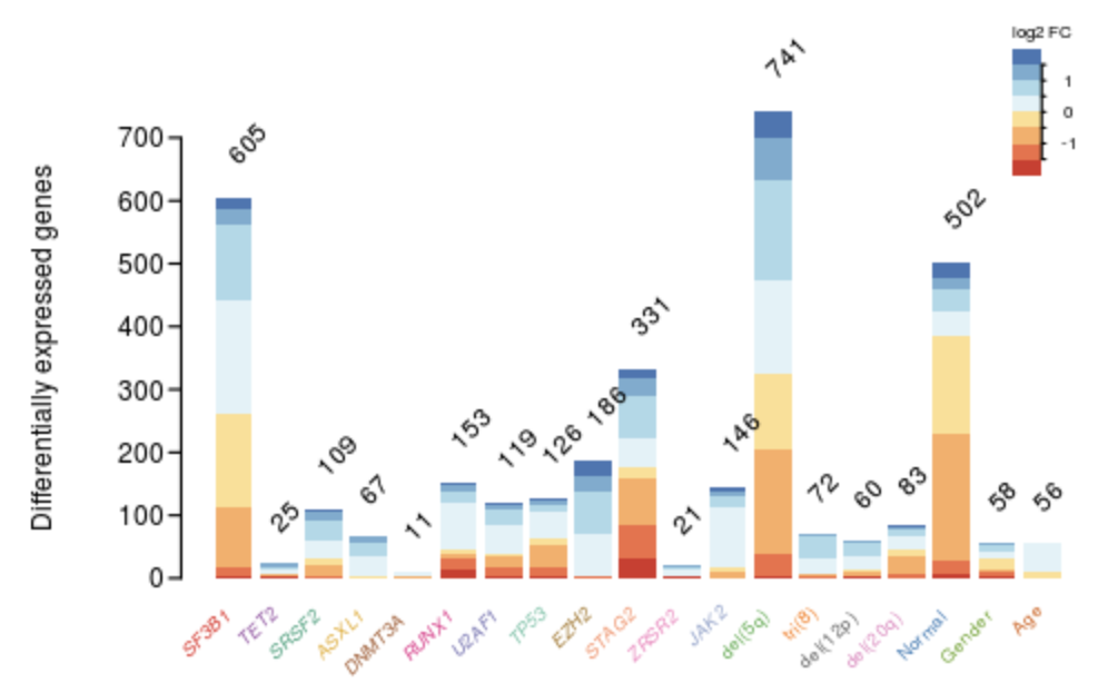
一眼就看出来了哪个基因的分组造成的表达量差异比较大,代码如下;
其中 glm 来源于昨天的教程:多分组的差异分析只需要合理设置design矩阵即可,通过lmFit,eBayes两个函数处理即可:
testResults <- decideTests(glm, method="hierarchical",adjust.method="BH", p.value=0.05)[,-1]
significantGenes <- sapply(1:ncol(testResults), function(j){
 c <- glm$coefficients[testResults[,j]!=0,j+1]
 table(cut(c, breaks=c(-5,seq(-1.5,1.5,l=7),5)))
})
colnames(significantGenes) <- colnames(testResults)
# Barplot
library(RColorBrewer)
library(Hmisc)
# author mg14 , https://rdrr.io/github/mg14/mg14/
rotatedLabel <- function(x0 = seq_along(labels), y0 = rep(par("usr")[3], length(labels)), labels, pos = 1, cex=1, srt=45, ...) {
 w <- strwidth(labels, units="user", cex=cex)
 h <- strheight(labels, units="user",cex=cex)
 u <- par('usr')
 p <- par('plt')
 f <- par("fin")
 xpd <- par("xpd")
 par(xpd=NA)
 text(x=x0 + ifelse(pos==1, -1,1) * w/2*cos(srt/360*2*base::pi), y = y0 + ifelse(pos==1, -1,1) * w/2 *sin(srt/360*2*base::pi) * (u[4]-u[3])/(u[2]-u[1]) / (p[4]-p[3]) * (p[2]-p[1])* f[1]/f[2] , labels, las=2, cex=cex, pos=pos, adj=1, srt=srt,...)
 par(xpd=xpd)
}

par(bty="n", mgp = c(2.5,.33,0), mar=c(3,3.3,2,0)+.1, las=2, tcl=-.25)
b <- barplot(significantGenes, las=2, ylab = "Differentially expressed genes",
 col=brewer.pal(8,"RdYlBu"),
 legend.text=FALSE , border=0, xaxt="n")#, col = set1[simple.annot[names(n)]], border=NA)
print(b)
rotatedLabel(x0=b, y0=rep(10, ncol(significantGenes)),
 labels=colnames(significantGenes), cex=.7, srt=45,
 font=ifelse(grepl("[[:lower:]]", colnames(design))[-1], 1,3) )
clip(0,30,0,1000)
#text(b+0.2, colSums(n)+50, colSums(n), pos=3, cex=.7, srt=90)
x0 <- 21.5
image(x=x0+c(0,0.8), y=par("usr")[4]+seq(-100,100,l=9), z=matrix(1:8, ncol=8), col=brewer.pal(8,"RdYlBu"), add=TRUE)
text(x=x0+1.5, y=par("usr")[4]+seq(-50,50,l=3), format(seq(-1,1,l=3),2), cex=0.66)
lines(x=rep(x0+.8,2), y=par("usr")[4]+c(-75,75))
segments(x0+.8,par("usr")[4]+seq(-75,75,l=7),x0+.9,par("usr")[4]+seq(-75,75,l=7))
text(x0+.8, par("usr")[4]+125, "log2 FC", cex=.66)
rotatedLabel(b-0.1, colSums(significantGenes), colSums(significantGenes), pos=3, cex=, srt=45)
作为学徒作业吧
可以选择数据集: https://www.ncbi.nlm.nih.gov/geo/query/acc.cgi?acc=GSE116436 主要是细胞系数量太多了,60个经典细胞系,而且是15个药物,所以样品数量巨多!
- 是 NCI-60 cell line panel after treatment with 15 anticancer agents.
每个药物都是有 好几百个转录组芯片样品数据,比如针对cisplatin这个药物的: https://www.ncbi.nlm.nih.gov/geo/query/acc.cgi?acc=GSE116439 ,也是有60个细胞系,但是假如我们仅仅是看其中一个细胞系:
GSM3232610 A498_cisplatin_0nM_24h
GSM3232611 A498_cisplatin_0nM_2h
GSM3232612 A498_cisplatin_0nM_6h
GSM3232613 A498_cisplatin_15000nM_24h
GSM3232614 A498_cisplatin_15000nM_2h
GSM3232615 A498_cisplatin_15000nM_6h
GSM3232616 A498_cisplatin_3000nM_24h
GSM3232617 A498_cisplatin_3000nM_2h
GSM3232618 A498_cisplatin_3000nM_6h
分组就稍微清晰一点了,就是不同浓度的cisplatin药物处理不同时间,两个变量的不同梯度,差异分析的组合还是在合理范围。
希望大家跑这个多次差异分析,然后使用前面的可视化方法!