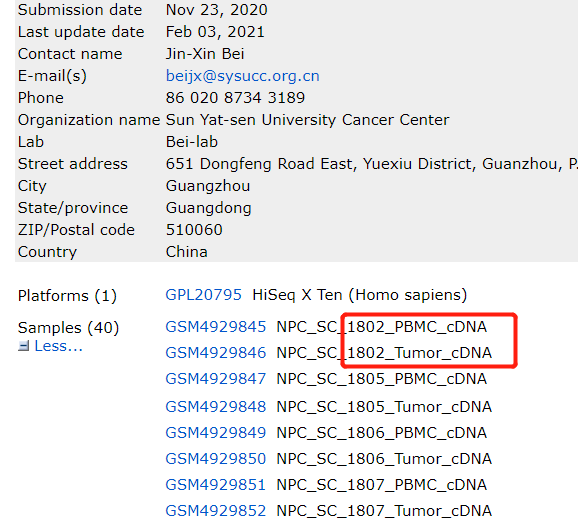
今天要介绍的文章是: Tumour heterogeneity and intercellular networks of nasopharyngeal carcinoma at single cell resolution. Nat Commun 2021 Feb 2;12(1):741. PMID: [33531485](https://www.ncbi.nlm.nih.gov/pubmed/33531485) , 数据在: https://www.ncbi.nlm.nih.gov/geo/query/acc.cgi?acc=GSE162025
可以看到是40个样品:
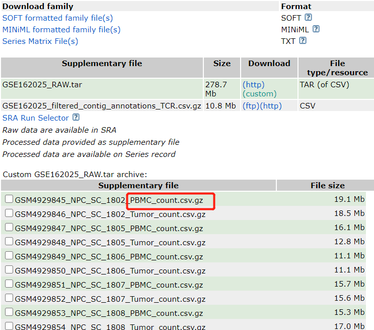
然后作者对每个样品都提供了一个压缩了的csv格式的表达量矩阵:
这个数据的研究成果是: Collectively, our study uncovers the heterogeneity and interacting molecules of the TME in NPC at single-cell resolution, which provide insights into the mechanisms underlying NPC progression and the development of precise therapies for NPC.
我们的目标是复现最开始的umap图,参考前面的例子:人人都能学会的单细胞聚类分群注释
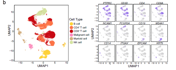
b UMAP plot of 176,447 single cells grouped into six major cell types (left panel) and the normalised expression of marker genes for each cell type (right panel). Each dot represents one single cell, coloured according to cell type (left panel), and the depth of colour from grey to blue represents low to high expression (right panel)
看起来平平无奇,实际上步骤很多,把17万细胞分成6个大群!而且右边可视化了6个大群的标记基因。
开始复现
首先保证 运行环境下面有一个 GSE162025_RAW 文件夹,里面有每个样品的csv格式的表达量矩阵文件, 数据在: https://www.ncbi.nlm.nih.gov/geo/query/acc.cgi?acc=GSE162025
step1构建对象
library(Seurat)
library(ggplot2)
library(clustree)
library(cowplot)
library(dplyr)
# remotes::install_github('chris-mcginnis-ucsf/DoubletFinder')
# remotes::install_github('immunogenomics/harmony')

###### step1:导入数据 ######
rm(list=ls())
options(stringsAsFactors = F)
library(data.table)
samples=list.files('GSE162025_RAW/')
samples
sceList = lapply(samples,function(x){
 # x=samples[1]
 print(x)
 y=file.path('GSE162025_RAW',x )
 a=fread(y,data.table = F)
 a[1:4,1:4]
 rownames(a)=a[,1]
 a=a[,-1]
 sce=CreateSeuratObject(a)
 return(sce)
})
sceList
sce.all=merge(x=sceList[[1]],
 y=sceList[ -1 ])

as.data.frame(sce.all@assays$RNA@counts[1:10, 1:2])
head(sce.all@meta.data, 10)
library(stringr)
phe=str_split(rownames(sce.all@meta.data),'_',simplify = T)
head(phe)
sce.all@meta.data$patient=phe[,2]
sce.all@meta.data$location=phe[,3]
sce.all@meta.data$orig.ident=paste(phe[,3],phe[,2],sep = '_')
table(sce.all@meta.data$orig.ident)
saveRDS(sce.all,file="sce.all_raw.rds")
step2 质量控制
library(Seurat)
library(ggplot2)
library(clustree)
library(cowplot)
library(dplyr)

rm(list=ls())
###### step2:QC质控 ######
dir.create("./1-QC")
setwd("./1-QC")
sce.all=readRDS("../sce.all_raw.rds")
#计算线粒体基因比例
# 人和鼠的基因名字稍微不一样
mito_genes=rownames(sce.all)[grep("^MT-", rownames(sce.all))]
mito_genes #13个线粒体基因
sce.all=PercentageFeatureSet(sce.all, "^MT-", col.name = "percent_mito")
fivenum(sce.all@meta.data$percent_mito)
#计算核糖体基因比例
ribo_genes=rownames(sce.all)[grep("^Rp[sl]", rownames(sce.all),ignore.case = T)]
ribo_genes
sce.all=PercentageFeatureSet(sce.all, "^RP[SL]", col.name = "percent_ribo")
fivenum(sce.all@meta.data$percent_ribo)
#计算红血细胞基因比例
rownames(sce.all)[grep("^Hb[^(p)]", rownames(sce.all),ignore.case = T)]
sce.all=PercentageFeatureSet(sce.all, "^HB[^(P)]", col.name = "percent_hb")
fivenum(sce.all@meta.data$percent_hb)
#可视化细胞的上述比例情况
feats <- c("nFeature_RNA", "nCount_RNA", "percent_mito", "percent_ribo", "percent_hb")
feats <- c("nFeature_RNA", "nCount_RNA")
p1=VlnPlot(sce.all, group.by = "orig.ident", features = feats, pt.size = 0.01, ncol = 2) +
 NoLegend()
library(ggplot2)
ggsave(filename="Vlnplot1.pdf",plot=p1)
ggsave(filename="Vlnplot1.png",plot=p1)
feats <- c("percent_mito", "percent_ribo", "percent_hb")
p2=VlnPlot(sce.all, group.by = "orig.ident", features = feats, pt.size = 0.01, ncol = 3, same.y.lims=T) +
 scale_y_continuous(breaks=seq(0, 100, 5)) +
 NoLegend()

ggsave(filename="Vlnplot2.pdf",plot=p2)

p3=FeatureScatter(sce.all, "nCount_RNA", "nFeature_RNA", group.by = "orig.ident", pt.size = 0.5)
ggsave(filename="Scatterplot.pdf",plot=p3)
#根据上述指标,过滤低质量细胞/基因
#过滤指标1:最少表达基因数的细胞&最少表达细胞数的基因
selected_c <- WhichCells(sce.all, expression = nFeature_RNA > 300)
selected_f <- rownames(sce.all)[Matrix::rowSums(sce.all@assays$RNA@counts>0) > 3]

sce.all.filt <- subset(sce.all, features = selected_f, cells = selected_c)
dim(sce.all)
dim(sce.all.filt)
# 可以看到,主要是过滤了基因,其次才是细胞

par(mar = c(4, 8, 2, 1))
C=sce.all.filt@assays$RNA@counts
dim(C)
C=Matrix::t(Matrix::t(C)/Matrix::colSums(C)) * 100
# 这里的C 这个矩阵,有一点大,可以考虑随抽样
C=C[,sample(1:ncol(C),1000)]
most_expressed <- order(apply(C, 1, median), decreasing = T)[50:1]
pdf("TOP50_most_expressed_gene.pdf",width=14)
boxplot(as.matrix(Matrix::t(C[most_expressed, ])),
 cex = 0.1, las = 1,
 xlab = "% total count per cell",
 col = (scales::hue_pal())(50)[50:1],
 horizontal = TRUE)
dev.off()
rm(C)

#过滤指标2:线粒体/核糖体基因比例(根据上面的violin图)
selected_mito <- WhichCells(sce.all.filt, expression = percent_mito < 15)
selected_ribo <- WhichCells(sce.all.filt, expression = percent_ribo > 3)
selected_hb <- WhichCells(sce.all.filt, expression = percent_hb < 0.1)
length(selected_hb)
length(selected_ribo)
length(selected_mito)
sce.all.filt <- subset(sce.all.filt, cells = selected_mito)
sce.all.filt <- subset(sce.all.filt, cells = selected_ribo)
sce.all.filt <- subset(sce.all.filt, cells = selected_hb)
dim(sce.all.filt)

table(sce.all.filt$orig.ident)
#可视化过滤后的情况
feats <- c("nFeature_RNA", "nCount_RNA")
p1_filtered=VlnPlot(sce.all.filt, group.by = "orig.ident", features = feats, pt.size = 0.1, ncol = 2) +
 NoLegend()
ggsave(filename="Vlnplot1_filtered.pdf",plot=p1_filtered)

feats <- c("percent_mito", "percent_ribo", "percent_hb")
p2_filtered=VlnPlot(sce.all.filt, group.by = "orig.ident", features = feats, pt.size = 0.1, ncol = 3) +
 NoLegend()
ggsave(filename="Vlnplot2_filtered.pdf",plot=p2_filtered)

#过滤指标3:过滤特定基因
# Filter MALAT1 管家基因
sce.all.filt <- sce.all.filt[!grepl("MALAT1", rownames(sce.all.filt),ignore.case = T), ]
# Filter Mitocondrial 线粒体基因
sce.all.filt <- sce.all.filt[!grepl("^MT-", rownames(sce.all.filt),ignore.case = T), ]
# 当然,还可以过滤更多

dim(sce.all.filt)

#细胞周期评分
sce.all.filt = NormalizeData(sce.all.filt)
s.genes=Seurat::cc.genes.updated.2019$s.genes
g2m.genes=Seurat::cc.genes.updated.2019$g2m.genes
sce.all.filt=CellCycleScoring(object = sce.all.filt,
 s.features = s.genes,
 g2m.features = g2m.genes,
 set.ident = TRUE)
p4=VlnPlot(sce.all.filt, features = c("S.Score", "G2M.Score"), group.by = "orig.ident",
 ncol = 2, pt.size = 0.1)
ggsave(filename="Vlnplot4_cycle.pdf",plot=p4)

sce.all.filt@meta.data %>% ggplot(aes(S.Score,G2M.Score))+geom_point(aes(color=Phase))+
 theme_minimal()
ggsave(filename="cycle_details.pdf" )
# S.Score较高的为S期,G2M.Score较高的为G2M期,都比较低的为G1期
质量控制的各个阈值都可以浮动调整的。
step3 降维聚类分群
sce.all.filt = FindVariableFeatures(sce.all.filt)
sce.all.filt = ScaleData(sce.all.filt,
vars.to.regress = c("nFeature_RNA", "percent_mito"))
sce.all.filt = RunPCA(sce.all.filt, npcs = 20)
sce.all.filt = RunTSNE(sce.all.filt, npcs = 20)
sce.all.filt = RunUMAP(sce.all.filt, dims = 1:10)
saveRDS(sce.all.filt, "sce.all_qc.rds")
sce =readRDS("sce.all_qc.rds")
# sce=sce.all.filt
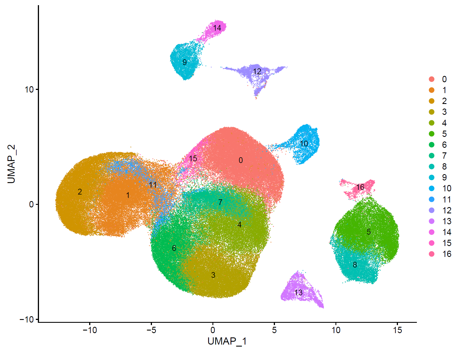
sce <- FindNeighbors(sce, dims = 1:10)
sce <- FindClusters(sce, resolution = 0.5)
names(sce@reductions)
colnames(sce@meta.data)
如下所示:
step4 细胞亚群注释
根据自己的肿瘤生物学背景,挑选合适的标记基因在各个亚群的表达情况:
library(ggplot2)
genes_to_check = c('PTPRC', 'CD3D', 'CD3E','CD4', 'CD8A','FOXP3','KLRD1', ## Tcells
 'CD19', 'CD79A', 'MS4A1' , # B cells
 'IGHG1', 'MZB1', 'SDC1', # plasma
 'CD68', 'CD163', 'CD14', 'CD86', 'CCL22','S100A4', ## DC(belong to monocyte)
 'CD68', 'CD163','MRC1','MSR1' ,'S100A8', ## Macrophage (belong to monocyte)
 'FGF7', 'MME','COL1A1','ACTA2','PECAM1', 'VWF' ,'PROX1', ## Fibroblasts,Endothelial
 'EPCAM', 'KRT19','KRT7','KRT8','KRT18', 'PROM1' ## epi or tumor
)
library(stringr)
p <- DotPlot(sce, features = unique(genes_to_check),
 assay='RNA' ,group.by = 'seurat_clusters' ) + coord_flip()

p
ggsave(plot=p, filename="check_marker_by_seurat_cluster.pdf")
如下所示:
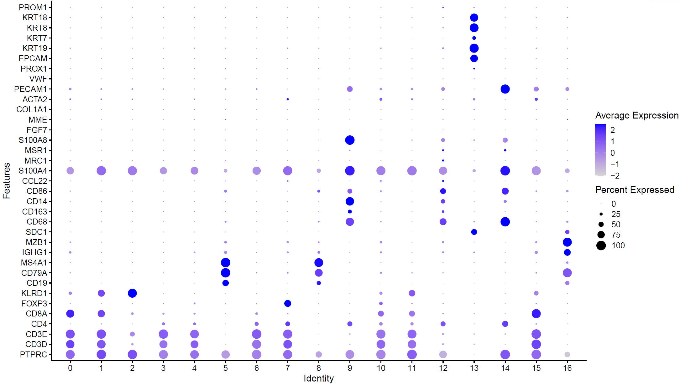
高表达不同基因的亚群可以根据生物学背景进行命名:
celltype=data.frame(ClusterID=0:16,
celltype='unkown')
celltype[celltype$ClusterID %in% c(0,15),2]='CD8T'
celltype[celltype$ClusterID %in% c(1,10,11),2]='NKT'
celltype[celltype$ClusterID %in% c(2),2]='NK'
celltype[celltype$ClusterID %in% c(3,4,6),2]='Tcells'
celltype[celltype$ClusterID %in% c(5,8),2]='Bcells'
celltype[celltype$ClusterID %in% c(7),2]='Treg'
celltype[celltype$ClusterID %in% c(9,12,14),2]='Myeloid'
celltype[celltype$ClusterID %in% c(13),2]='Epi'
celltype[celltype$ClusterID %in% c(16),2]='plasma'
head(celltype)
celltype
table(celltype$celltype)
sce.all=sce
sce.all@meta.data$celltype = "NA"
for(i in 1:nrow(celltype)){
sce.all@meta.data[which(sce.all@meta.data$seurat_clusters == celltype$ClusterID[i]),'celltype'] <- celltype$celltype[i]}
table(sce.all@meta.data$celltype)
p <- DotPlot(sce.all, features = unique(genes_to_check),
assay='RNA' ,group.by = 'celltype' ) + coord_flip()
p
ggsave(plot=p, filename="check_marker_by_celltype.pdf")
table(sce.all@meta.data$celltype,sce.all@meta.data$seurat_clusters)
sce=sce.all
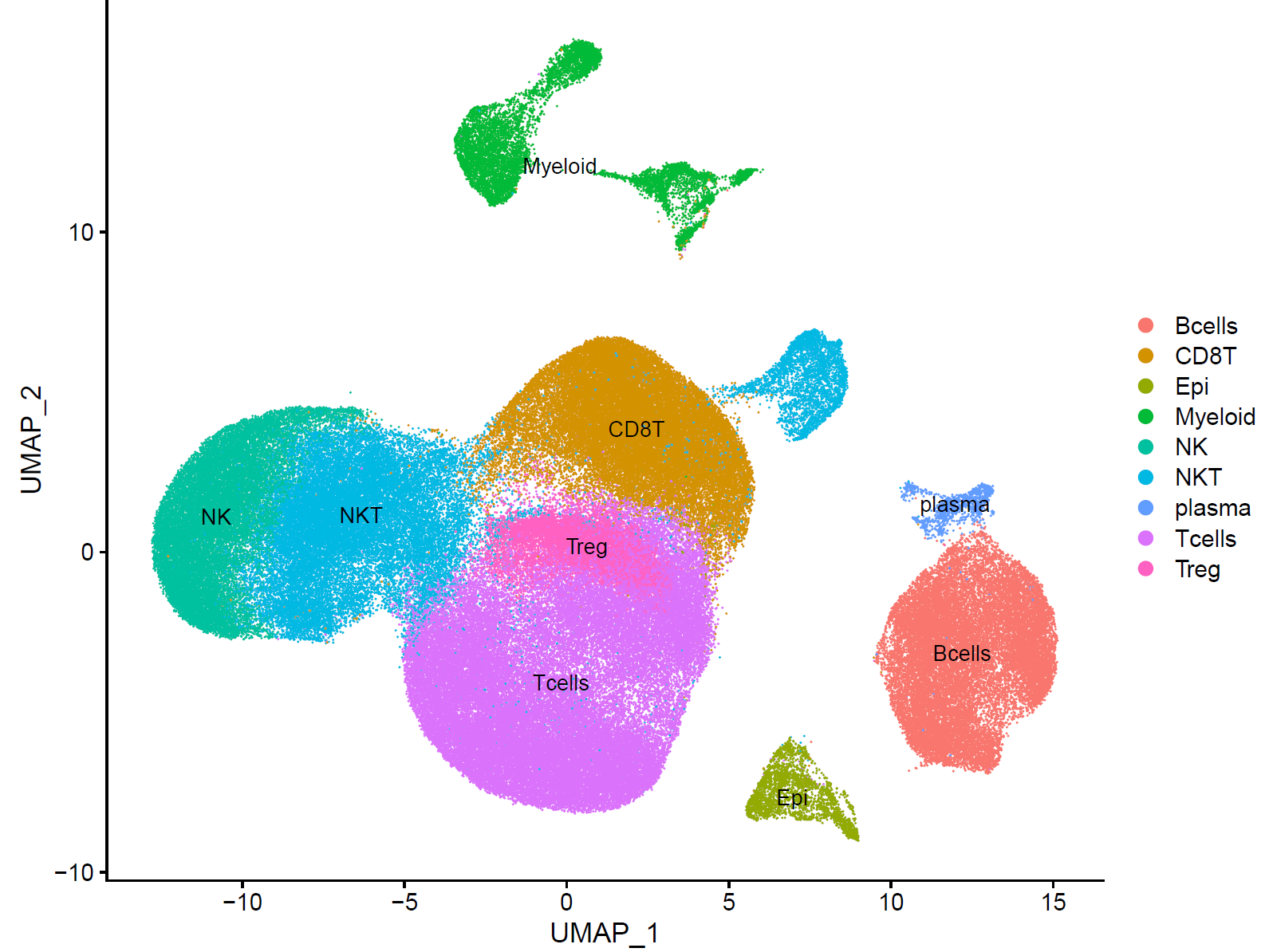
p.dim.cell=DimPlot(sce, reduction = "tsne", group.by = "celltype",label = T)
p.dim.cell
ggsave(plot=p.dim.cell,filename="DimPlot_tsne_celltype.pdf",width=9, height=7)
p.dim.cell=DimPlot(sce, reduction = "umap", group.by = "celltype",label = T)
p.dim.cell
ggsave(plot=p.dim.cell,filename="DimPlot_umap_celltype.pdf",width=9, height=7)
最后拿到了有生物学意义的亚群:
这就是完成了最基础的聚类分群和注释,也可以参考其它例子,比如:人人都能学会的单细胞聚类分群注释
如果你没有单细胞转录组数据分析的基础知识,可以先一下基础10讲: