最近有粉丝在我们《生信技能树》公众号后台付费求助,想follow一个文章 做他自己感兴趣的一个数据集的WGCNA分析。
因为他的课题是保密的,我这里不方便提疾病名字和数据集,就show他想follow的文章吧,是《Weighted gene co-expression network analysis identified underlying hub genes and mechanisms in the occurrence and development of viral myocarditis》。因为对方让我们先秀一秀肌肉,所以我把这个文章的WGCNA分析安排给了学徒,感谢学徒在这个春节假期还兢兢业业完成任务!
下面是学徒的探索
0 基础信息
文献:《加权基因共表达网络分析确定了病毒性心肌炎发生和发展中的核心基因和机制》
《Weighted gene co-expression network analysis identified underlying hub genes and mechanisms in the occurrence and development of viral myocarditis》
文献doi号:10.21037/atm-20-3337
数据集:GSE35182
-
数据芯片:Affymetrix Mouse Gene 1.0 ST Array
-
数据内容:病毒性心肌炎小鼠模型的心脏RNA表达谱
-
是3个分组,分组情况:
- an acute infection group (coxsackievirus B3 infection for 10 days)
- chronic infection group (coxsackievirus B3 infection for 90 days)
- normal group (PBS injection)
1.文献的方法及结果
1.1 下载原始数据
下载CEL原始数据;使用Affy包读取,并且RMA算法处理;
The raw data in CEL format were read using the Affy package version 1.62.0 (17) and processed using the robust multiarray average (RMA) algorithm (Figure 1A,B) (18).

1.2 数据清洗
- 缺失值的处理:Next, we used the impute.knn function in the impute package version 1.58.0 to impute the individual missing values in the raw data.
This function used the Euclidean metric to find k nearest genes that were similar to the expression profiles of each gene with a missing value, and estimated the missing value through the expression values of nearest genes.
-
方差排序筛选:the 6,680 genes exhibiting the most significant expression changes (the top 25% of rank genes with the largest variance) were selected for further analysis.筛选出表达变化最显著的6680个基因(方差最大的前25%)进一步分析。
-
样本聚类树:A total of 18 samples were used as input for the hierarchical clustering analysis.

1.3 构建共表达网络
使用WGCNA包(版本1.68)构建共表达网络(the co-expression network)
- 确定软阈值(R2 > 0.9)
When the soft-threshold β was equal to 14 the independence degree rose to 0.964.
-
构建共表达网络:Next, the co-expression network was constructed using a one-step method and the correlation matrix was constructed to calculate the correlation efficiency between genes.
-
构建了拓扑重叠矩阵(TOM)确定基因连接度;
-
层次聚类确定模块:Genes with similar patterns were clustered into the same modules (minimum size =30) using average linkage hierarchical clustering. The relationships between phenotypes and modules were calculated to identify highly related modules. 计算表型与模块之间的关系,确定高度相关的模块。

- 对高度相关的模块进行分析,并且结果可视化;

1.4 功能注释
使用 the clusterProfiler package version 3.12.0 on R 对高度相关模块进行功能注释。
- The P value was adjusted by the Holm–Bonferroni method.
- 阈值设定:The adjusted P value cutoff was set at 0.05 and the q-value cutoff was set at 0.2.
- 根据 gene counts 对分析结果进行排序;
1.5 hub基因的识别
每个基因的“IC”是通过与同一模块中其他基因的连接强度相加来计算的。对于一个给定的基因来说,IC越高,它与其他基因的关系就越强,它在模块中的地位就越重要。hub genes are the genes that possess high IC values.
中心基因和模块中其他基因之间的相互作用网络使用 Cytoscape version 3.7.2 可视化。
1.6 预测潜在的miRNA靶向网络
通过miRNet (www.mirnet.ca),从每个模块中选出IC排名前100位的基因,预测miRNA靶向网络。这个时候需要使用Cytoscape 进行网络可视化。
2 文献图表复现
主要复现图表:

就是表达矩阵下载,质量控制,然后有个WGCNA流程,把基因划分为不同功能的模块后,指定感兴趣的模块进行后续分析!
2.1 数据下载及预处理
2.1.1 数据下载
参考Jimmy老师的教程: 从GEO数据库下载得到表达矩阵 一文就够
表达矩阵的获取:从GEO的GSE35182界面,下载”GSE35182_RAW.tar”文件,并使用R包 Affy 处理。
library(affy)
dir_cels <- "./GSE35182_RAW"
affy_data = ReadAffy(celfile.path=dir_cels)

#(1)未经RMA处理
dat_bf <- log2(exprs(affy_data)+1) #便于绘制boxplot图
class(dat_bf);dim(dat_bf)
#(2)RMA
dat_rma <- rma(affy_data)
dat_rma <- exprs(dat_rma) #exprs提取表达矩阵
class(dat_rma);dim(dat_rma)

#(3)简化列名
library(stringr)
colnames(dat_bf) <- str_sub(colnames(dat_bf),1,9)
colnames(dat_rma) <- str_sub(colnames(dat_rma),1,9)

#(4)可视化并存为PDF
pdf(file = "RMA_boxplot.pdf",width = 20,height = 10)
par(cex = 8)
par(mfrow = c(1,2))
boxplot(dat_bf, main = "Data before RMA",range=0)
boxplot(dat_rma, main = "Data after RMA",range=0)
dev.off()
提取临床信息,即构建样本对应临床trait矩阵。偷懒使用了getGEO获取临床信息。
library(AnnoProbe)
library(GEOquery)
if(!file.exists("pdata.Rdata")) {gset <- getGEO("GSE35182",destdir=".",getGPL = F)
 # 因为这个GEO数据集只有一个GPL平台,所以下载到的是一个含有一个元素的list
 a=gset[[1]]
 pdata <- pData(a)#样本分组信息
 gpl <- a[1]@annotation
 save(pdata,gpl,file = "pdata.Rdata")}
load("pdata.Rdata")

#提取分组信息group
length(pdata$title)
##[1] 24
group_list=ifelse(str_detect(pdata$title,"pbs"),"N",
 ifelse(str_detect(pdata$title,"10"),"A10","C90"))
group_list=factor(group_list,levels = c("N","A10","C90"))
group_list
在提取分组信息时发现原始数据共有24个样本,但文献作者只选择了18个样本, 从figure S1可以看到是A,C,N这3个分组各6个样品,但是跟临床信息是不匹配了,我们需要后续探索出来。
2.1.2 修改表达矩阵列名
由boxplot图可知文献将表达矩阵列名根据分组进行了修改,当然也可能只是作者对图的坐标名进行了修改。 (PS: 因为学徒代码能力比较弱,所以修改表达矩阵列名使用了下面的超级丑陋的代码,不过问题是解决了,所以不重要哈)
dat <- dat_rma
## 先检查dat和pdata对应关系
p = identical(pdata[,2],colnames(dat));p
if(!p) dat = dat[,match(pdata[,2],colnames(dat))]

FA<- ifelse(str_detect(pdata[,1],"pbs"),"N",
 ifelse(str_detect(pdata[,1],"10"),"A","C"))
nA = 0;nN = 0;nC = 0
result = list()
for(i in 1:length(FA)){
 if(FA[i] == "A"){
 nA = nA +1
 result[[i]] = paste0(FA[i],nA)
 }else if (FA[i] == "C") {
 nC = nC + 1
 result[[i]] = paste0(FA[i],nC)
 }else if(FA[i] == "N"){
 nN = nN + 1
 result[[i]] = paste0(FA[i],nN)
 }
}
ndat <- do.call(rbind,result)
ndat <- as.data.frame(ndat)
ndat <- cbind(ndat[1],pdata[1:2])
colnames(dat) <- ndat$V1
2.1.3 表达量可视化-绘制图1AB
#(1)修改图x轴名
colnames(dat_rma) == colnames(dat_bf)
colnames(dat_rma) <- ndat$V1
colnames(dat_bf) <- ndat$V1

#(2)绘图
pdf(file = "fig1_AB.pdf",width = 27,height = 6)
par(cex.main = 1,cex.lab = 15)
par(mfrow = c(1,2))
boxplot(dat_bf, main = "Data before RMA",range=0)
boxplot(dat_rma, main = "Data after RMA",range=0)
dev.off()

save(gpl,dat,ndat,pdata,group_list,file = "Step1data.Rdata")
可以看到,图表跟文献是一模一样。
2.2 数据清洗
2.2.1 处理缺失值
library(WGCNA)
load("Step1data.Rdata")
#对缺失值进行判断
gsg = goodSamplesGenes(dat, verbose = 3)
gsg$allOK
#1.处理缺失值----
library(impute)
table(is.na(dat))
beta=impute.knn(dat)
# impute.knn(data ,k = 10, rowmax = 0.5, colmax = 0.8, maxp = 1500, rng.seed=362436069)
betaData=beta$data
table(is.na(betaData))
betaData=betaData+0.00001
dat <- betaData
2.2.2 基因注释
(1) 注释-ids获取
gpl

##法一:借助注释包进行,缺点不易下载:
#mogene10sttranscriptcluster
#https://cloud.tencent.com/developer/article/1549012
if(!require(mogene10sttranscriptcluster.db))BiocManager::install("mogene10sttranscriptcluster.db")
library(mogene10sttranscriptcluster.db)
ls("package:mogene10sttranscriptcluster.db")
ids <- toTable(mogene10sttranscriptclusterSYMBOL)
head(ids)

##法二:使用曾老师的idmap1包
#library(devtools)
#install_github("jmzeng1314/idmap1")
library(idmap1)
ids=getIDs('GPL6246')
head(ids)
(2) 与注释信息整合在一起
probe_id <- rownames(dat)
tdat <- cbind(dat,probe_id)
tdat <- merge(x=tdat,y=ids,by='probe_id')
dim(tdat)
#这里处理一个探针对应不同gene名的情况,随便取一个就行
tdat <- tdat[!duplicated(tdat$symbol,fromLast = TRUE),]
dim(tdat)
dat <- dat[tdat$probe_id,]
dim(dat)
2.2.3 排序并取方差前25%
exp <- as.data.frame(dat)
exp$sd=apply(exp,1,sd)
exp=exp[order(exp$sd,decreasing = TRUE),]
dim(exp)
tj <- quantile(exp$sd,0.75);tj
exp <- exp[exp$sd >= tj,]
dim(exp)
#如果按原文献,找6680个为25%:
# exp <- exp[exp$sd > 0.351,] 6672;不进行注释
# exp <- exp[exp$sd >= 0.2201,] 6680;注释后
dat <- dat[rownames(exp),]

save(dat,ids,file = "Step2clear.Rdata")
2.2.3 样本聚类树
sampleTree = hclust(dist(t(dat)), method = "average");

par(cex = 0.6);
par(mar = c(0,6,6,0))
plot(sampleTree,
 main = "Sample clustering to detect outliers",
 sub="",
 xlab="",
 cex.lab = 1.5,
 cex.axis = 1.5,
 cex.main = 1.5)

从此样本可大致猜想,原文献作者可能选择去除的6个样为:N7-N12,因为这6个样品被混入C这个分组,去除它们后,可以保证这个层次聚类恰好划分为 A,C,N这3个分组,而且是每个分组都是6个样品。
2.3 构建共表达网络
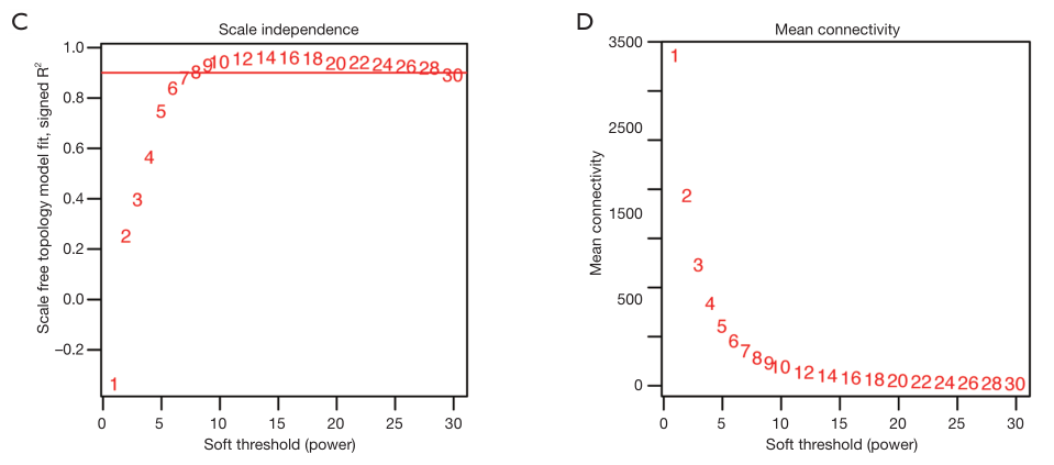
2.3.1 确定软阈值
library(WGCNA)
dat0 <- t(dat)

powers = c(c(1:10), seq(from = 12, to=20, by=2))
# Call the network topology analysis function
sft = pickSoftThreshold(dat0,
 powerVector = powers,
 verbose = 5)

## Power SFT.R.sq slope truncated.R.sq mean.k. median.k. max.k.
## 1 1 0.46100 1.3900 0.903 1660.00 1700.00 2500
## 2 2 0.00281 0.0473 0.819 790.00 792.00 1540
## 3 3 0.27800 -0.4390 0.883 447.00 429.00 1070
## 4 4 0.59300 -0.7180 0.949 280.00 254.00 804
## 5 5 0.76300 -0.8940 0.972 188.00 157.00 632
## 6 6 0.83700 -1.0300 0.977 133.00 100.00 518
## 7 7 0.87900 -1.1100 0.977 97.80 66.30 436
## 8 8 0.90300 -1.1700 0.976 74.00 44.80 373
## 9 9 0.92500 -1.2300 0.979 57.50 31.00 327
## 10 10 0.93000 -1.2700 0.974 45.50 21.80 292
## 11 12 0.92300 -1.3500 0.961 30.00 11.20 239
## 12 14 0.91300 -1.4000 0.945 20.80 6.12 200
## 13 16 0.87800 -1.4400 0.911 15.00 3.51 171
## 14 18 0.88000 -1.4600 0.912 11.10 2.06 148
## 15 20 0.87200 -1.4600 0.904 8.51 1.26 129

po <- sft$powerEstimate
## sft$powerEstimate值为7
可视化
par(mfrow = c(1,2));
cex1 = 0.9;

# Scale-free topology fit index as a function of the soft-thresholding power
plot(sft$fitIndices[,1],
 -sign(sft$fitIndices[,3])*sft$fitIndices[,2],
 xlab="Soft Threshold (power)",
 ylab="Scale Free Topology Model Fit,signed R^2",
 type="n",
 main = paste("Scale independence"))
text(sft$fitIndices[,1],
 -sign(sft$fitIndices[,3])*sft$fitIndices[,2],
 labels=powers,cex=cex1,col="red")

# this line corresponds to using an R^2 cut-off of h
abline(h=0.90,col="red")

# Mean connectivity as a function of the soft-thresholding power
plot(sft$fitIndices[,1],
 sft$fitIndices[,5],
 xlab="Soft Threshold (power)",
 ylab="Mean Connectivity",
 type="n",main = paste("Mean connectivity"))
text(sft$fitIndices[,1],
 sft$fitIndices[,5],
 labels=powers, cex=cex1,col="red")
复现结果:

上述图形的横轴均代表权重参数β,左图纵轴代表对应的网络中log(k)与log(p(k))相关系数的平方。相关系数的平方越高,说明该网络越逼近无网路尺度的分布。右图的纵轴代表对应的基因模块中所有基因邻接函数的均值。最佳的beta值就是
sft$powerEstimate,引文:一文学会WGCNA分析
2.3.2 一步构建网络
cor <- WGCNA::cor
net = blockwiseModules(dat0, power = po,
 TOMType = "unsigned", minModuleSize = 30,
 reassignThreshold = 0, mergeCutHeight = 0.25,
 numericLabels = TRUE, pamRespectsDendro = FALSE,
 saveTOMs = TRUE,saveTOMFileBase = "femaleMouseTOM",
 verbose = 3)
cor<-stats::cor

class(net)
names(net)
table(net$colors)
保存相关信息
moduleLabels = net$colors
moduleColors = labels2colors(net$colors)
MEs = net$MEs;
geneTree = net$dendrograms[[1]];
save(net,MEs, moduleLabels, moduleColors, geneTree,
 file = "Step3networkConstruction-auto.RData")
结果可视化
# Convert labels to colors for plotting
mergedColors = labels2colors(net$colors)

# Plot the dendrogram and the module colors underneath
plotDendroAndColors(geneTree,
 mergedColors[net$blockGenes[[1]]],
 "Module colors",
 dendroLabels = FALSE,
 hang = 0.03,
 addGuide = TRUE,
 guideHang = 0.05)
复现结果:

2.4 绘制模块相关性图
2.4.1 Modules-traits relationships
# Define numbers of genes and samples
dat <- t(dat)
nGenes = ncol(dat)
nSamples = nrow(dat)

# Recalculate MEs with color labels
MEs0 = moduleEigengenes(dat, moduleColors)$eigengenes
MEs0[1:6,1:6]
MEs = orderMEs(MEs0)
MEs[1:6,1:6]

#traits,但此处只需要分组,用group_list代替
design=model.matrix(~0+ group_list)
colnames(design)=levels(group_list)

moduleTraitCor = cor(MEs, design, use = "p")
head(moduleTraitCor)

moduleTraitPvalue = corPvalueStudent(moduleTraitCor,nSamples)
head(moduleTraitPvalue)
添加数值&可视化
#数值:
textMatrix = paste(signif(moduleTraitCor, 2),
 "\n(",signif(moduleTraitPvalue, 1),
 ")",
 sep = "");
dim(textMatrix) = dim(moduleTraitCor)
textMatrix[1:6,1:3]

par(mar = c(3, 12, 3, 1));
# Display the correlation values within a heatmap plot
design1 <- as.data.frame(design)
labeledHeatmap(Matrix = moduleTraitCor,
 xLabels = names(design1),
 yLabels = names(MEs),
 ySymbols = names(MEs),
 colorLabels = FALSE,
 colors = blueWhiteRed(50),
 textMatrix = textMatrix,
 setStdMargins = FALSE,
 cex.text = 1,
 zlim = c(-1,1),
 main = paste("Module-trait relationships"))

2.4.2 模块与基因表达相关性
module membership (MM) and gene significance (GS)
# Define variable weight containing the weight column of datTrait
Acute = as.data.frame(design1$A);
names(Acute) = "Acute"

# names (colors) of the modules
modNames = substring(names(MEs), 3)

geneModuleMembership = as.data.frame(cor(dat, MEs, use = "p"));
MMPvalue = as.data.frame(corPvalueStudent(as.matrix(geneModuleMembership), nSamples));

names(geneModuleMembership) = paste("MM", modNames, sep="")
names(MMPvalue) = paste("p.MM", modNames, sep="")

geneTraitSignificance = as.data.frame(cor(dat, Acute, use = "p"))
GSPvalue = as.data.frame(corPvalueStudent(as.matrix(geneTraitSignificance), nSamples))

names(geneTraitSignificance) = paste("GS.", names(Acute), sep="")
names(GSPvalue) = paste("p.GS.", names(Acute), sep="")

module = "turquoise"
column = match(module, modNames);
moduleGenes = moduleColors==module;

#sizeGrWindow(7, 7);
par(mfrow = c(1,1));
verboseScatterplot(abs(geneModuleMembership[moduleGenes, column]),
 abs(geneTraitSignificance[moduleGenes, 1]),
 xlab = paste("Module Membership in", module, "module"),
 ylab = "Gene significance for body weight",
 main = paste("Module membership vs. gene significance\n"),
 cex.main = 1.2, cex.lab = 1.2, cex.axis = 1.2, col = module)

参考
生信技能树多个教程分享WGCNA的实战细节,见:
-
一文看懂WGCNA 分析(2019更新版) (点击阅读原文即可拿到测序数据)
- 通过WGCNA作者的测试数据来学习
- 重复一篇WGCNA分析的文章(代码版)
- 重复一篇WGCNA分析的文章(解读版)(逆向收费读文献2019-19)
- 关键问题答疑:WGCNA的输入矩阵到底是什么格式
- WGCNA-流程及原理细节直播互动授课(今晚八点)
其他:
网页工具是不可能做到如此的个性化
部分粉丝会说,这么简单的WGCNA分析有什么好分享的,这样的态度完全是“饱汉不知饿汉饥”,也有部分粉丝会说,大量的网页工具都可以做WGCNA了啊,还需要自己从头到尾学习它吗?还得学习R语言?
其实呢,如果你有时间请务必学习R语言,自由自在的探索海量的公共数据,辅助你的科研,那么:
如果你没有时间从头开始学编程,也可以委托专业的团队付费拿到同样的数据分析,这样的WGCNA分析费用是2400元,可以拿到全部的数据和代码。
- 需要自己读文献筛选合适的数据集
- 提供1个小时左右的一对一讲解WGCNA背景知识。
如果需要委托,直接在我们《生信技能树》公众号留言即可,我们会安排合适的生信工程师对接具体的项目。