绘图需求最大的难关往往是数据整理,比如下面的双层list:
set.seed(123456)
gs=list(tmp1=list(g1=sample(1000,abs(floor(100*rnorm(1)))),
 g2=sample(1000,abs(floor(100*rnorm(1))))),
 tmp2=list(g1=sample(1000,abs(floor(100*rnorm(1)))),
 g2=sample(1000,abs(floor(100*rnorm(1))))),
 tmp3=list(g1=sample(1000,abs(floor(100*rnorm(1)))),
 g2=sample(1000,abs(floor(100*rnorm(1))))))
gs
这个双层list的数据结构如下:
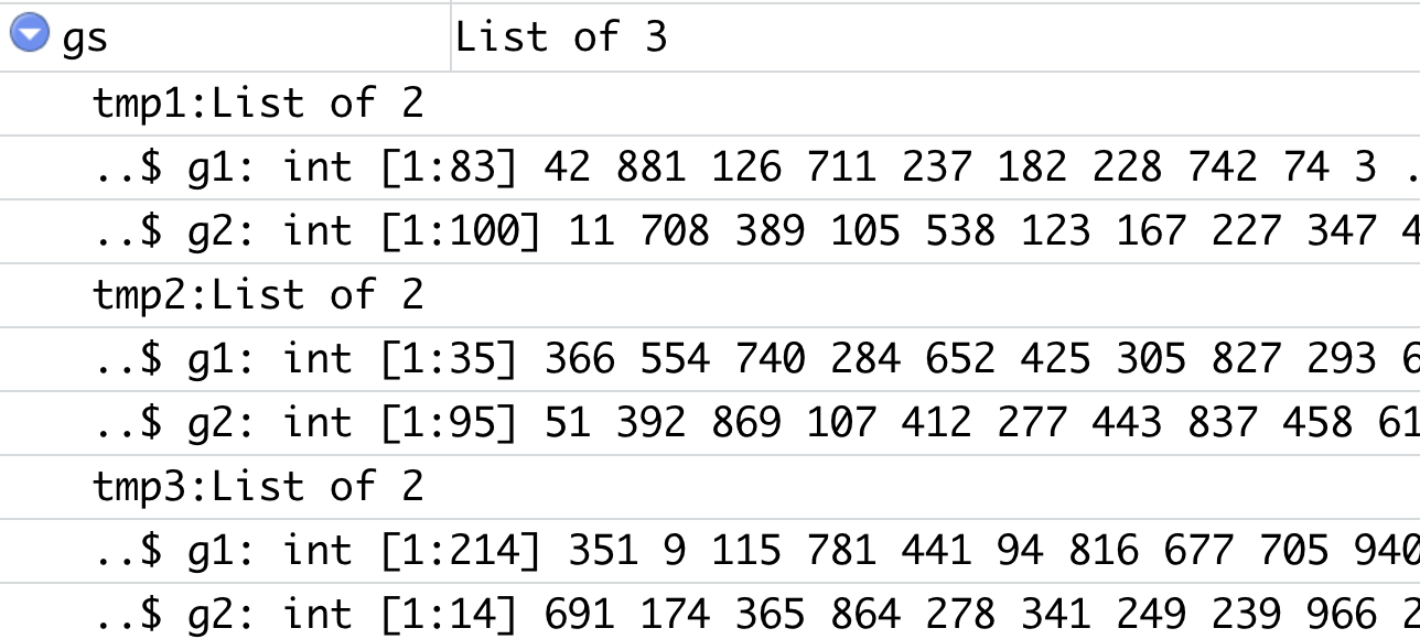
有3个样本,每个样本里面都是上下调基因集合,以 g1和g2区分:
require("VennDiagram")
VENN.LIST <- lapply(gs, function(x) x$g1)
venn.plot1 <- venn.diagram(VENN.LIST , NULL,
 fill=c("red", "blue",'green'),
 alpha=c(0.5,0.5,0.5), cex = 2, cat.fontface=4,
 category.names=c('tmp1','tmp2','tmp3'),
 main="g1 Gene Lists")
# To plot the venn diagram we will use the grid.draw() function to plot the venn diagram
grid.draw(venn.plot1)

require("VennDiagram")
VENN.LIST <- lapply(gs, function(x) x$g2)
venn.plot2 <- venn.diagram(VENN.LIST , NULL,
 fill=c("red", "blue",'green'),
 alpha=c(0.5,0.5,0.5), cex = 2, cat.fontface=4,
 category.names=c('tmp1','tmp2','tmp3'),
 main="g2 Gene Lists")
# To plot the venn diagram we will use the grid.draw() function to plot the venn diagram
grid.draw(venn.plot2)

grid.newpage()
grid.draw(venn.plot1)
grid.newpage()
grid.draw(venn.plot2)
如下所示:
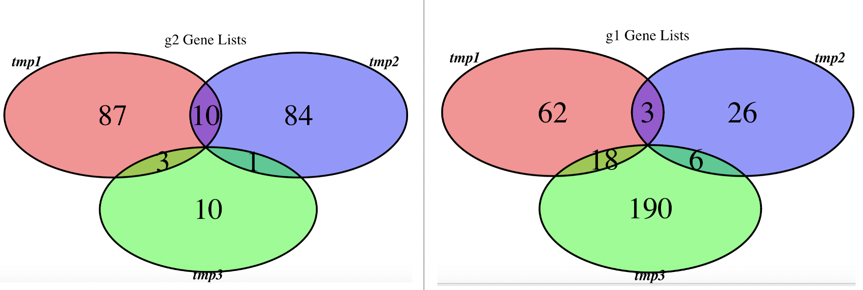
韦恩图固然是一种展现方式,可以看到3个样品各自的上下调基因的overlap情况,基本上呢,随机生成的数值它们的overlap不咋地!
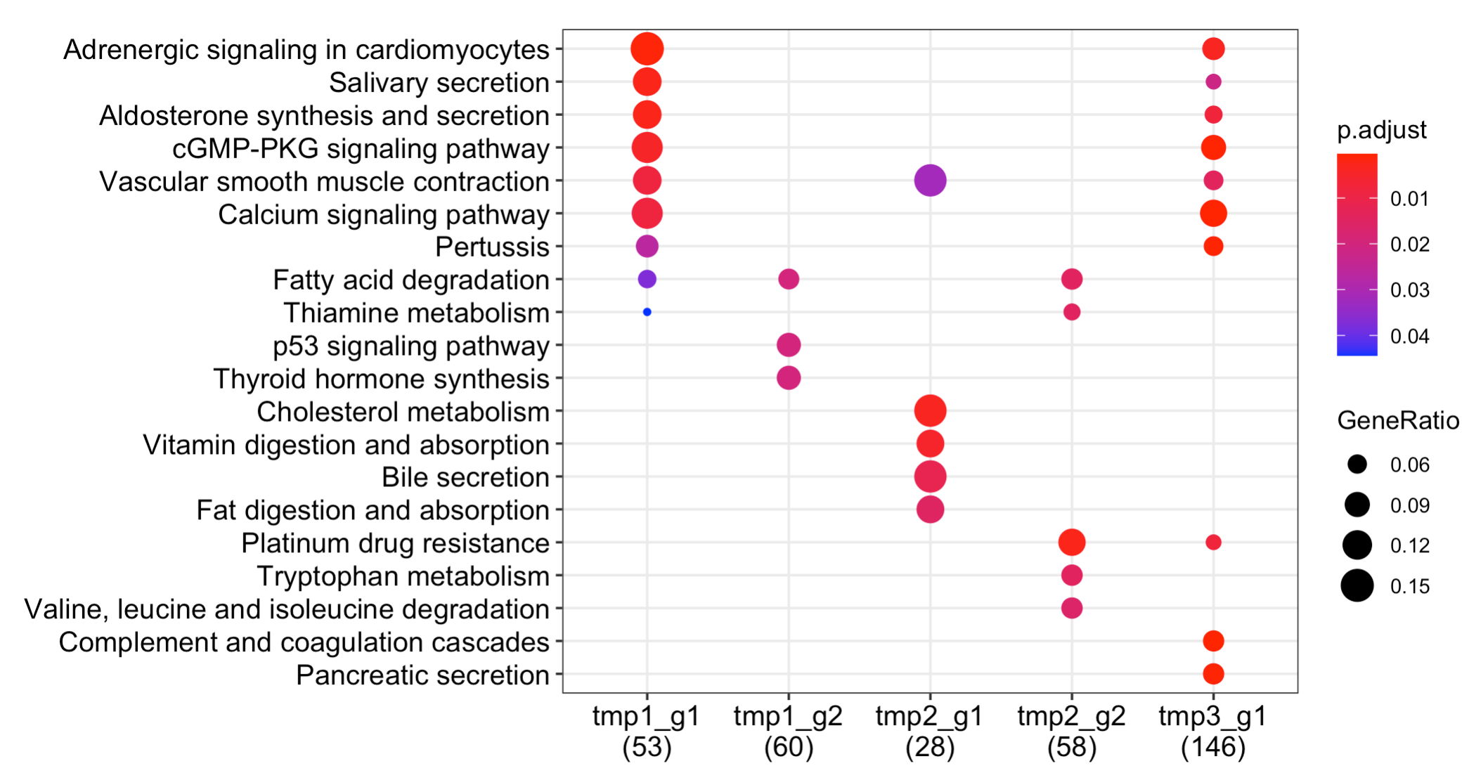
但是呢,3个样品我们其实更想看各自的上下调基因集的生物学功能,需要把这个双层list变成长形数据框 ,超级复杂,下面的代码:
deg=gs
deg_list=lapply(names(deg), function(y){
 tmp=deg[[y]]
 data.frame(group= paste(y,unlist(lapply(names(tmp), function(x){
 rep(x,length(tmp[[x]]))
 })),sep='_') ,
 gene=unlist(tmp))
})
group_g=do.call(rbind,deg_list)
group_g=do.call(rbind,deg_list)
library(org.Hs.eg.db)
group_g$gene=toTable(org.Hs.egSYMBOL)[group_g$gene,2]
head(group_g)

library(clusterProfiler)

# Convert gene ID into entrez genes
head(group_g)
tmp <- bitr(group_g$gene, fromType="SYMBOL",
 toType="ENTREZID",
 OrgDb="org.Hs.eg.db")

de_gene_clusters=merge(tmp,group_g,by.x='SYMBOL',by.y='gene')
table(de_gene_clusters$group)
head(de_gene_clusters)

list_de_gene_clusters <- split(de_gene_clusters$ENTREZID,
 de_gene_clusters$group)

library(ggplot2)
gcSample= list_de_gene_clusters
xx <- compareCluster(gcSample, fun="enrichKEGG",
 organism="hsa", pvalueCutoff=0.05)
dotplot(xx)
出图如下:
全部的代码,复制粘贴即可运行,但是要自己写错了,需要对R语言的数据结果有比较好理解,稍微有一点点难!