Jimmy老师看到一个学生复现了一个单细胞数据挖掘文章的图,可能是为了检测我在单细胞天地和B站学习的单细胞知识情况,遂让我也来做这个文献的单细胞部分的新鲜出炉的单细胞数据挖掘文章图表复现。
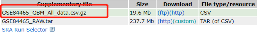
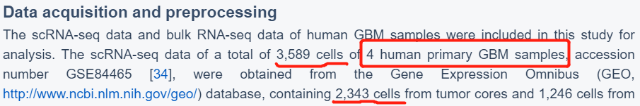
今年9月底发表在Aging-US(IF=4.831)上的一篇纯生信分析文章(“Glioblastoma cell differentiation trajectory predicts theimmunotherapy response and overall survival of patients”),该文章基于GEO的单细胞测序数据发现了具有不同分化特征的胶质母细胞瘤(GBM)细胞,继而进行差异表达分析找到分化相关的基因(GDRG),最后根据这些基因分别构建了分子分型与预后预测模型。
天地良心,单细胞天地推文我看了,B站视频我看了….1遍(没有怎么看太懂,我补)
其实最开始的想法是,Jimmy老师直接说如果做不出来就找他要另外那个同学的答案,我想着可能会在公众号发教程呢….
(悄咪咪的等了大半个月)无果,行吧,自己动手!!!
开始battle
没什么好说的,跟着jimmy老师的代码,读取这个表达矩阵文件,然后构建单细胞的seurat对象,一通标准代码搞起来!
rm(list=ls())
options(stringsAsFactors = F)
library(Seurat)
library(GEOquery)
library(dplyr)
library(Seurat)
library(patchwork)
# Load data
###我瞎折腾了...明明可以直接用read.table("GSE84465_GBM_All_data.csv.gz"),我自以为是的在外面解压了,并且怎么都读取不进来,所以我用了fread读取,还得改列名,删第一列,变为数据框....
library(data.table)
df = fread(file = 'GSE84465_GBM_All_data.csv/GSE84465_GBM_All_data.csv',encoding = 'UTF-8')
head(colnames(df))
head(rownames(df))

df = as.data.frame(df)
rownames(df) = df[,1]
df = df[,-1]
head(rownames(df))

raw.data = df
dim(raw.data)
raw.data[1:4,1:4]
head(colnames(raw.data))

# Load metadata 可以有另外一种方式下载表型信息~
gset <- getGEO('GSE84465', destdir=".",
 AnnotGPL = F, ## 注释文件
 getGPL = F)
phenoDat <- pData(eSet)
head(phenoDat[,1:4])

metadata = phenoDat
head(metadata)

save(df,raw.data,metadata,file = 'data.Rdata')
经过一番折腾,得到了两个数据,表达矩阵和表型信息!!
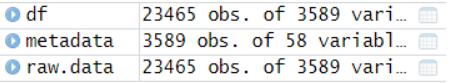
可以看到23465个基因,3589个细胞,接下来就靠这两个数据来构建seurat对象啦!
- 下载表型信息的另外一种方式(借鉴别人的,我之前也不知道)。一样读取进来就可,同样是得到表型信息的矩阵。但是两种方式得到的表型信息不一致,可以自己斟酌:
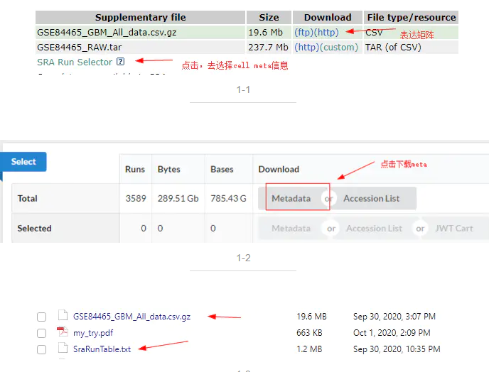
简单检查一下表型信息,如下:
load('data.Rdata')
##grep这个函数是真好用啊啊
index1=grep('Tumor',metadata$description)
metadata=metadata[index1,]
##匹配一下删掉Periphery组织后保留的表型信息
raw.data = raw.data[,colnames(raw.data) %in% metadata$description.1]
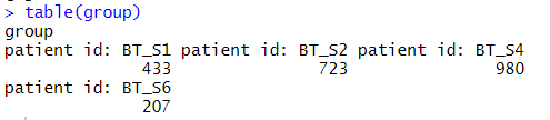
##查看metadata里的信息,看出哪些列是需要的,这里group分组需要的是来源于4个不同的GBM样本
group = metadata$characteristics_ch1.4
table(group)
随时看数据的格式和内容
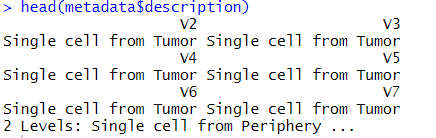
病人的分组来源于4个胶质母细胞瘤样本:
过滤不合格的细胞和基因(数据质控很重要)
不知道排除ERCC对文章的后续分析有多大影响,可以看出过滤掉了92个基因!!
# Find ERCC's, compute the percent ERCC, and drop them from the raw data.
erccs <- grep(pattern = "^ERCC-", x = rownames(x = raw.data), value = TRUE)
percent.ercc <- Matrix::colSums(raw.data[erccs, ])/Matrix::colSums(raw.data)
fivenum(percent.ercc)
ercc.index <- grep(pattern = "^ERCC-", x = rownames(x = raw.data), value = FALSE)
raw.data <- raw.data[-ercc.index,]
dim(raw.data)
主要是也不懂ERCC的左右,先去除再说吧!
#根据以下质量控制标准,排除了194个低质量细胞:
#1)排除了<3个细胞中检测到的基因;
#2)排除总检测基因少于50个的细胞;
#3)线粒体表达基因≥5%的细胞被排除
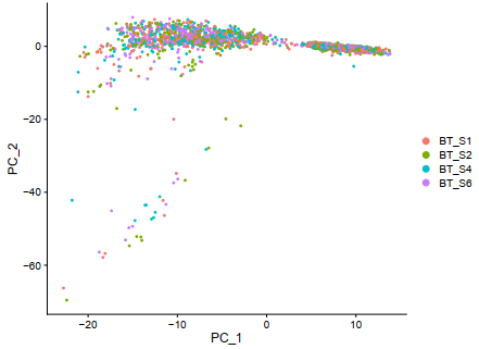
folders=c('BT_S1','BT_S2','BT_S4','BT_S6')
table(group)
# Initialize the Seurat object with the raw (non-normalized data).
main_tiss <- CreateSeuratObject(counts = raw.data, project = folders, min.cells = 3, min.features = 50)
main_tiss
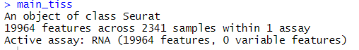
文献直接说过滤了194个细胞,而我通过一样的过滤方式,过滤了2个细胞和3409个基因。
这个时候谨记jimmy老师的训诫:初学者不要在各种旁枝末节上面钻牛角尖!(但是这个数量级差异让我有点忐忑!!!)
过滤线粒体和核糖体基因
靠自己多看文献来获取到底通过什么方式来过滤,使用什么阈值来过滤,多看多学习!
Jimmy老师说可以多次反复查看线粒体核糖体基因的影响,分群前后看,不同batch看,多次质控图表里面显示它,判断它是否是一个主要因素。
# add rownames to metadta
row.names(metadata) <- metadata$description.1
# add metadata to Seurat object
main_tiss <- AddMetaData(object = main_tiss, metadata = metadata)
main_tiss <- AddMetaData(object = main_tiss, percent.ercc, col.name = "percent.ercc")
# Head to check
head(main_tiss@meta.data)
# Calculate percent ribosomal genes and add to metadata
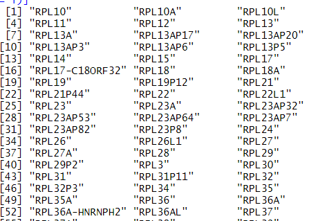
ribo.genes <- grep(pattern = "^RP[SL][[:digit:]]", x = rownames(x = main_tiss@assays$RNA@data), value = TRUE)
percent.ribo <- Matrix::colSums(main_tiss@assays$RNA@counts[ribo.genes, ])/Matrix::colSums(main_tiss@assays$RNA@data)
fivenum(percent.ribo)
main_tiss <- AddMetaData(object = main_tiss, metadata = percent.ribo, col.name = "percent.ribo")
main_tiss
#02
raw_sce <- main_tiss
raw_sce
rownames(raw_sce)[grepl('^mt-',rownames(raw_sce),ignore.case = T)]
rownames(raw_sce)[grepl('^Rp[sl]',rownames(raw_sce),ignore.case = T)]
#seurat包的函数:PercentageFeatureSet 可以用来计算线粒体基因含量。
raw_sce[["percent.mt"]] <- PercentageFeatureSet(raw_sce, pattern = "^MT-")
fivenum(raw_sce[["percent.mt"]][,1])
rb.genes <- rownames(raw_sce)[grep("^RP[SL]",rownames(raw_sce),ignore.case = T)]
C<-GetAssayData(object = raw_sce, slot = "counts")
percent.ribo <- Matrix::colSums(C[rb.genes,])/Matrix::colSums(C)*100
fivenum(percent.ribo)
raw_sce <- subset(raw_sce, subset = nCount_RNA > 50000 & nFeature_RNA > 500 & percent.mt < 5)
raw_sce
可以看到并没有线粒体基因,说明可能没有破碎的细胞?或者说是,这个作者上传表达矩阵的时候把基因名字搞错了???
核糖体基因
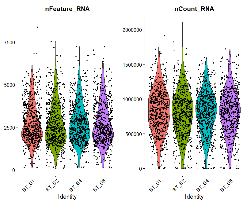
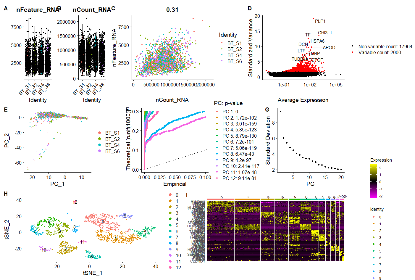
A = VlnPlot(raw_sce, features = c("nFeature_RNA", "nCount_RNA"), ncol = 2)
B <- FeatureScatter(raw_sce, feature1 = "nCount_RNA", feature2 = "nFeature_RNA")

ggplot2::ggsave(filename = 'A.pdf')
A
B
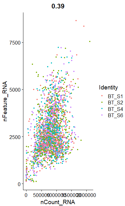
呃其实这些图的意义大概就在于你可以通过大概的图形趋势看看你到底应该通过什么方式来过滤这些不必要的因素。
归一化和标准化
代码里面的FindVariableFeatures和RunPCA函数,是两种不同策略的降维:
- 首先FindVariableFeatures是硬过滤,根据一些统计指标,比如sd,mad,vst等等来判断你输入的单细胞表达矩阵里面的2万多个基因里面,最重要的2000个基因,其余的1.8万个基因下游分析就不考虑了。
- 然后RunPCA函数其实跑完之后2000个基因会转变为2000个维度,但是我们通常看前面的十几个维度就ok了,所以也是一个效率非常高的降维方式。
sce=raw_sce
sce
#首先去除样本/细胞效应
sce <- NormalizeData(sce, normalization.method = "LogNormalize",
 scale.factor = 10000)
GetAssay(sce,assay = "RNA")
sce <- FindVariableFeatures(sce,
 selection.method = "vst", nfeatures = 2000)
# Identify the 10 most highly variable genes
top10 <- head(VariableFeatures(sce), 10)

# plot variable features with and without labels
C = plot2 <- LabelPoints(plot = plot1, points = top10, repel = TRUE)

ggplot2::ggsave(filename = 'C.pdf')
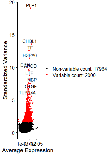
可以直接在文中看出变化最大的十个基因,炫酷的图,但是我没有画好它!
# 步骤 ScaleData 的耗时取决于电脑系统配置(保守估计大于一分钟)
sce <- ScaleData(sce)
sce <- RunPCA(object = sce, pc.genes = VariableFeatures(sce))
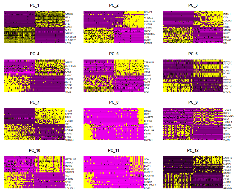
DimHeatmap(sce, dims = 1:12, cells = 100, balanced = TRUE)
# NOTE: This process can take a long time for big datasets, comment out for expediency. More
# approximate techniques such as those implemented in ElbowPlot() can be used to reduce
# computation time
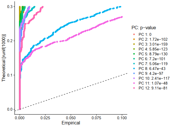
sce <- JackStraw(sce, num.replicate = 100)
sce <- ScoreJackStraw(sce, dims = 1:12)
E1 = JackStrawPlot(sce, dims = 1:20)
ggplot2::ggsave(filename = 'E1.pdf')
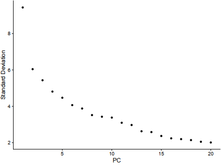
E2 = ElbowPlot(sce)
ggplot2::ggsave(filename = 'E2.pdf')
D = DimPlot(sce, reduction = "pca",,group.by ='orig.ident')
ggplot2::ggsave(filename = 'D.pdf')
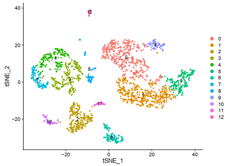
###resolution取0.5的时候刚好是文章所需要的13个分群
sce <- FindNeighbors(sce, dims = 1:12)
sce <- FindClusters(sce, resolution = 0.5)
table(sce@meta.data$RNA_snn_res.0.5)

library(gplots)
tab.1=table(sce@meta.data$RNA_snn_res.0.5,sce@meta.data$RNA_snn_res.0.5)
balloonplot(tab.1)

set.seed(123)
sce <- RunTSNE(object = sce, dims = 1:12, do.fast = TRUE)
F = DimPlot(sce,reduction = "tsne",label=T)
ggplot2::ggsave(filename = 'F.pdf')
phe=data.frame(cell=rownames(sce@meta.data),
cluster =sce@meta.data$seurat_clusters)
head(phe)
table(sce@meta.data$seurat_clusters)
for( i in unique(sce@meta.data$seurat_clusters) ){
markers_df <- FindMarkers(object = sce, ident.1 = i, min.pct = 0.25)
print(x = head(markers_df))
markers_genes = rownames(head(x = markers_df, n = 5))
VlnPlot(object = sce, features =markers_genes,log =T )
FeaturePlot(object = sce, features=markers_genes )
}
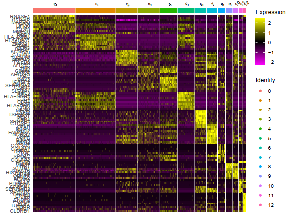
sce.markers <- FindAllMarkers(object = sce, only.pos = TRUE, min.pct = 0.25,
thresh.use = 0.25)
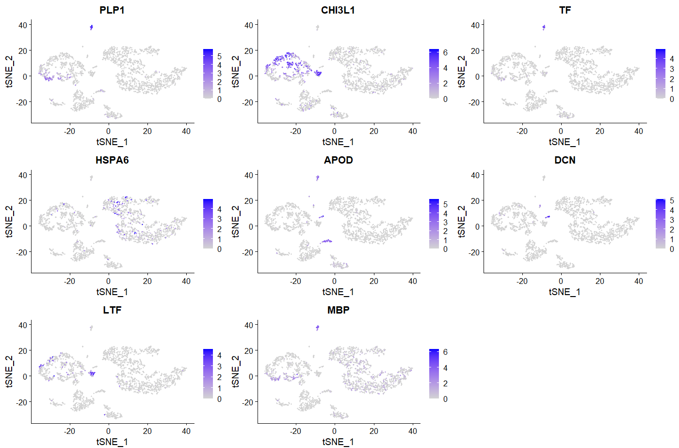
###我随便选了8个画画图
FeaturePlot(sce, features = c("PLP1","CHI3L1","TF","HSPA6","APOD","DCN","LTF","MBP"))
library(dplyr)
top10 <- sce.markers %>% group_by(cluster) %>% top_n(10, avg_logFC)
G = DoHeatmap(sce,top10$gene,size=3)

save(sce,sce.markers,file = 'first_sce.Rdata')
save(A,B,C,D,E1,E2,F,G,file = 'second_sce.Rdata')
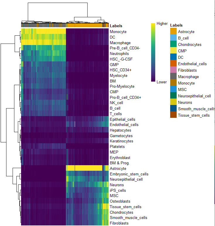
###### 最后是细胞亚群的自动化注释
rm(list=ls())
options(stringsAsFactors = F)
library(Seurat)

library(SingleR)
load(file = 'HumanPrimaryCellAtlasData.Rdata')
hpca.se
load(file = 'first_sce.Rdata')

table(sce@meta.data$seurat_clusters)

sce_for_SingleR <- GetAssayData(sce, slot="data")
sce_for_SingleR

pred.hesc <- SingleR(test = sce_for_SingleR, ref = hpca.se, labels = hpca.se$label.main,
 method = "cluster", clusters = clusters,
 assay.type.test = "logcounts", assay.type.ref = "logcounts")
table(pred.hesc$labels)
table(pred.hesc$labels,phe$seurat_clusters)
plotScoreHeatmap(pred.hesc)
clusters=sce@meta.data$seurat_clusters
celltype = data.frame(ClusterID=clusters, celltype=pred.hesc$labels)
sce@meta.data$singleR=celltype[match(clusters,celltype$ClusterID),'celltype']
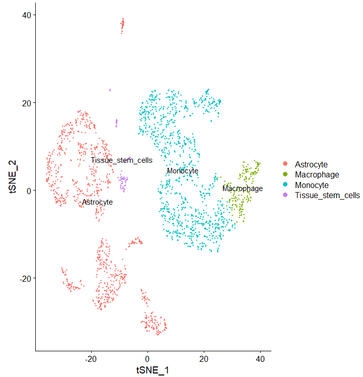
DimPlot(sce, reduction = "tsne", group.by = "singleR",label = T)
phe=sce@meta.data
table(phe$singleR)
呃我上面的分组呢?是合并了么
p <- (A|B|C)/
 (D|E1|E2) /
 (F|G) + plot_annotation(tag_levels = 'A')
p
之前Jimmy老师讲过这个拼图方式….我完美的忘了,这么厉害的拼图,后续只需要在AI里简单修改一下就超神啦。
代码是Jimmy老师的,我仅仅是根据自己的理解做了一些改动,如果有不对的地方敬请指正,怼我就是你对,咱初学者,要的就是读者的质疑。