小提琴图在单细胞领域应用非常广泛,能比较好地展现具体的某个基因在不同的单细胞亚群的表达量高低分布情况,如下:
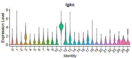
这个图说明了这个Igkc基因,基本上每个细胞亚群都有表达,其中在编号为11的亚群尤为高表达,但我们通常是不会选择这样的基因作为标志基因。
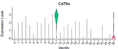
但是下面的Cd79a基因就不一样了,比较特异性的在编号为11的亚群高表达。
通常来说,在单细胞数据处理项目里面,有seurat可以完成一切,同样的,小提琴图也是如此,被包装成为了函数可以直接依据R里面的seurat对象来进行可视化,首先需求找到合适的基因进行可视化,通常是具体的每个细胞亚群的标志基因,代码如下:
# 前面构建 sce 对象的代码,见往期教程:
markers_df <- FindMarkers(object = sce, ident.1 = 0, min.pct = 0.25)
print(x = head(markers_df))
markers_genes = rownames(head(x = markers_df, n = 5))
VlnPlot(object = sce, features =markers_genes,log =T )
FeaturePlot(object = sce, features=markers_genes )
在seurat对象里面可视化当然问题不大,不过有些时候,大家会有个性化的可视化需求,或者干脆就不想依据seurat对象进行可视化,而是直接拿到指定基因在全部细胞的表达量以及细胞的分组信息,有这两个信息,就可以自定义的可视化了。
比如我发布在B站的全网第一个单细胞课程(免费基础课程)介绍的那篇文献:
-
务必听课后完成结业考核20题:https://mp.weixin.qq.com/s/lpoHhZqi-_ASUaIfpnX96w
-
课程配套资料(主要是代码和PPT)文档在:https://docs.qq.com/doc/DT2NwV0Fab3JBRUx0
就是首先作者自定义了一个绘图函数,接受基因名字,tsne的坐标矩阵,以及表达量矩阵。
#violin plots represent gene expression for each subpopulation. The color of each violin represents the mean gene expression after log2 transformation.
#gene: Gene name of interest as string. DATAuse: Gene expression matrix with rownames containing gene names. tsne.popus = dbscan output, axis= if FALSE no axis is printed. legend_position= default "none" indicates where legend is plotted. gene_name = if FALSE gene name will not be included in the plot.
plot.violin2 <- function(gene, DATAuse, tsne.popus, axis=FALSE, legend_position="none", gene_name=FALSE){

 testframe<-data.frame(expression=as.numeric(DATAuse[paste(gene),]), Population=tsne.popus$cluster)
 testframe$Population <- as.factor(testframe$Population)
 colnames(testframe)<-c("expression", "Population")

 col.mean<-vector()
 for(i in levels(testframe$Population)){
 col.mean<-c(col.mean,mean(testframe$expression[which(testframe$Population ==i)]))
 }
 col.mean<-log2(col.mean+1)

 col.means<-vector()

 for(i in testframe$Population){
 col.means<-c(col.means,col.mean[as.numeric(i)])
 }
 testframe$Mean<-col.means
 testframe$expression<-log2(testframe$expression+1)


 p <- ggplot(testframe, aes(x=Population, y=expression, fill= Mean, color=Mean))+
 geom_violin(scale="width") +
 labs(title=paste(gene), y ="log2(expression)", x="Population")+
 theme_classic() +


 scale_color_gradientn(colors = c("#FFFF00", "#FFD000","#FF0000","#360101"), limits=c(0,14))+
 scale_fill_gradientn(colors = c("#FFFF00", "#FFD000","#FF0000","#360101"), limits=c(0,14))+

 theme(axis.title.y = element_blank())+
 theme(axis.ticks.y = element_blank())+
 theme(axis.line.y = element_blank())+
 theme(axis.text.y = element_blank())+
 theme(axis.title.x = element_blank())+


 theme(legend.position=legend_position )

 if(axis == FALSE){
 p<-p+
 theme( axis.line.x=element_blank(),
 axis.text.x = element_blank(),
 axis.ticks.x = element_blank())

 }

 if(gene_name == FALSE){
 p<-p+ theme(plot.title = element_blank())
 }else{ p<-p + theme(plot.title = element_text(size=10,face="bold"))}

 p

}
定义好绘图函数后,理论上可以绘制任意基因的表达量在不同的聚类的分组表达情况:
plot.violin2(gene = "Pdgfra", DATAuse = RPKM.full, tsne.popus = CAFgroups_full)
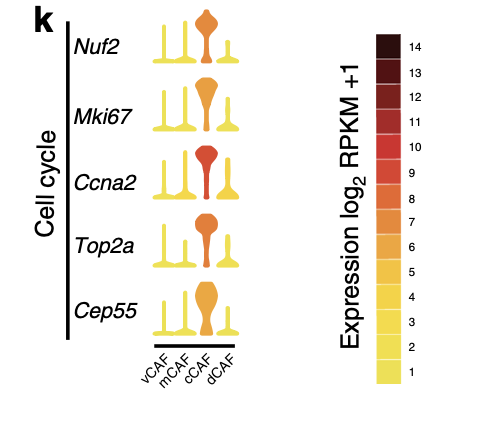
需要对ggplot绘图知识有一定的认知,缺点就是代码有点长!在文章里面比较好的展现了感兴趣的通路里面一系列基因在不同亚群的表达量差异情况,如下:
实际上初学者可以比较简单的使用 ggpubr进行绘图,代码如下:
# 其中X是稀疏矩阵,拿到指定基因表达量
v=x[,match('CD8A',genes)]
# 然后meta是细胞的表型信息,其中meta$Major.cell.type列是单细胞分群结果
boxplot(v~meta$Major.cell.type,las=2)
library(ggpubr)
df=data.frame(v=v,type=meta$Most.likely.LM22.cell.type)
ggboxplot(df, "type", "v", color = "type" ) +
 theme(axis.text.x = element_text(angle = 90, hjust = 1))
这个示例需求仍然是
粉丝继续看小提琴图,发现表达量排序是安装细胞亚群的名字进行排序,想修改为按照表达该基因的均值排序。
按照细胞亚群表达该基因的均值排序
这个排序,其实被因子控制,所以我加上了两行代码,如下:
v=x[,match('CD8A',genes)]
boxplot(v~meta$Major.cell.type,las=2)
library(ggpubr)
df=data.frame(v=v,type=meta$Most.likely.LM22.cell.type)
cm=unlist(lapply(split(df,df$type), function(x){
 mean(x[,1])
}))
# 主要的代码就是依据表达量均值,来确定细胞亚群的顺序。
df$type=factor(df$type,levels = names(sort(cm,decreasing = T)))
ggboxplot(df, "type", "v", color = "type" ) +
 theme(axis.text.x = element_text(angle = 90, hjust = 1))
粉丝还想继续提要求,被我严厉制止了,毕竟我本来就是来见面的, 真的没有想到,居然还要现场考核代码!