首先是从测试原始数据里面得到汇总数据
然后把各种统计汇总数据可视化成图表
最后根据图表来写作文即可。
来源:Genome-wide Mapping of HATs and HDACs Reveals Distinct Functions in Active and Inactive Genes
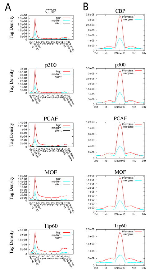
比如下面这个图,就是CHIP-seq的数据,比对后根据全基因组的所有基因的区域范围内的reads密度的总结:
故事该怎么写呢?
首先看图例:
A. Profiles of HATs binding across 5’ gene ends, 3’ gene ends and gene body regions of the 1000 most active, intermediately active and least active genes were examined using ChIP-Seq.txStart: transcription start site. txEnd: transcription end site.
B. Profiles of HATs binding across intergenic (5kb away from any gene) or promoter (defined
as +/− 1kb surrounding TSS) DNase HS sites. DNase HS sites were obtained from (Boyle et
al., 2008).
作者做了5个HATs基因的CHIP-seq数据,根据上面的图,可以把它们分成3组,分别是CBP and p300,PCAF (p300/CBP associated factor) and GCN5,MOF and Tip60,它们虽然都是蛋白质的乙酰化酶,但是它们的CHIP-seq数据表现不一致,仔细看上图就明白了。为什么不一致,就需要解释,解释就需要有生物学背景,比如CBP and p300结构上高度同源,前人研究也表明主要是参与转录起始。而PCAF (p300/CBP associated factor) and GCN5是另外一组的高度同源,前人研究参与转录延伸。最后的MOF and Tip60是MYST family of HATs,跟上面的HATs不大一样,前人研究表明它们参与的功能特别多样性,所以在基因上面的结合密度跟其它不一样。最后再扯一扯它们在其它物种的功能如何如何,跟人类比较一下如何如何。再找几个已有的CHIP-seq数据交叉验证一下,再说一下自己也做实验随机验证了一些,因为高通量测序毕竟不是金标准。
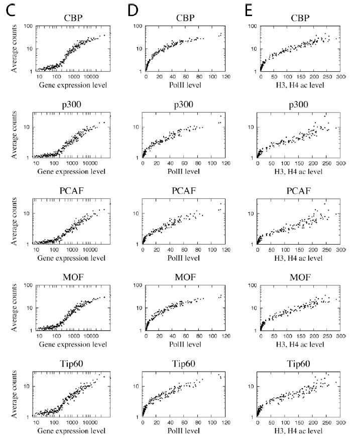
下面这张图是把CHIP-seq数据的reads密度和基因的表达量关联起来,也很简单。
故事该怎么写呢?
首先看图例:
C. Correlation between HAT binding and gene expression levels. Genes were grouped to 100
gene (one dot in the figure) sets according to expression level. The HAT binding level in
promoter region was calculated for the same 100 gene sets. The y-axis indicates the HAT
binding level and the x-axis indicates the expression level.
D. Correlation between HAT binding and RNA Pol II binding levels among the 100 gene sets
grouped according to expression levels as defined in panel C. The y-axis indicates the HAT
binding level and the x-axis indicates the Pol II level.
E. Correlation between HAT binding and histone acetylation levels among the 100 gene sets
grouped according to expression levels as defined in panel C. The acetylation level was
calculated by pooling all reads for 18 histone acetylations mapped previously (Wang et al.,
2008). The y-axis indicates the HAT binding level and the x-axis indicates the acetylation level.
图例就很复杂了,但是信息量很少。就是根据转录组数据把基因分区段,不同表达水平的基因组它们的对应的基因的CHIP-seq数据的密码如何,很简单的一个相关图。就是为了说明它们跟基因的表达水平是正相关的。其实表达水平就是polyII的结合密度,也可以看看polyII的结合密度跟这些CHIP-seq的IP的结合密度看看相关性,也能说明同样的结论。
此文的作者把HATs系列酶都做了CHIP-seq数据,同时也把HDACs系列酶也做了CHIPseq数据!~~~
一般人入门生物信息学的时候问题都集中在如何得到可绘图的数据,因为绘图很简单,哪怕是不会R语言,在excel也能做。至于后面的看图写作文,主要是考验生物学底蕴了。
最后说一下下面这个图:
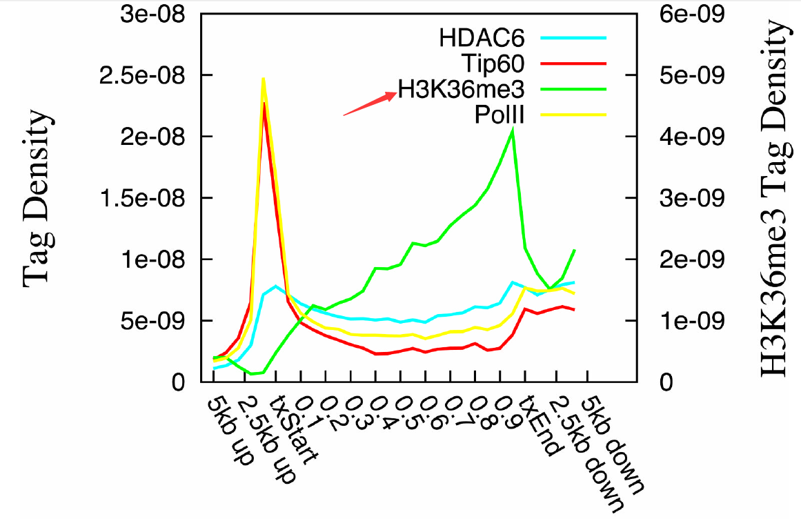
A. Distribution profiles of HDAC6, Tip60, Pol II and H3K36me3 across the active genes were
plotted. The left y-axis indicates tag densities for HDAC6, Tip60 and Pol II. The right axis
indicates tag densities for H3K36me3.
这个没什么好说的了,很明显HATs和HDACs和polyII都是一样的pattern,都代表着转录激活,跟H3K36me6的pattern有显著区别。这个现象很新颖,很有趣,再扯一堆生物学意义就好,为什么HATs和HDACs和polyII都是一样的pattern呢?给自己的假设和猜想。前提是要有生物学背景知识。
而且,如何得到这样的绘图的数据,讲起来就比较复杂了。