用pheatmap来绘图首先要安装这个包,它就一个功能,画出热图即可,号称是pretty heatmap,的确比其它的好用很多。我以前写过《一步一步学习heatmap.2》的教程,很简单的那种,所以就没有公布在博客上面,结果发现很多其它博客居然能先我一步发出。其实包括本次的pheatmap指南,都没什么好发,的在R里面也是傻瓜式出图,无法就是自己熟练一下参数而已,又不是开发一个包,没什么技术含量。我这里单独提一下pheatmap是因为它的确非常好用,将会是我画热图的不二之选。比如下面这个,是我最喜欢的:
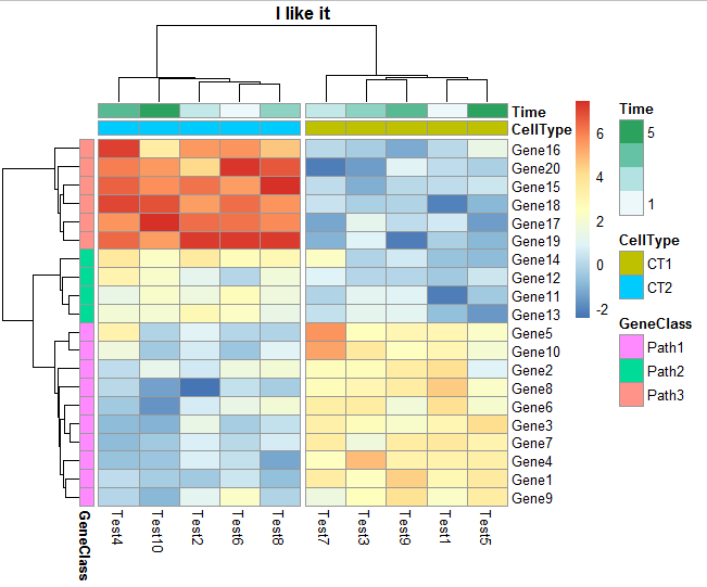
里面该有的信息一应俱全了,包括基因可以分成上下调来显色,基因和样本都可以单独聚类,单独排序,样本也可以具体再分组。热图也可以调整配色方案,单元格的宽度和高度都可以自由调整。把它说明书的代码一句句运行一遍就明白了:ftp://cran.r-project.org/pub/R/web/packages/pheatmap/pheatmap.pdf
代码如下:
## PS:我代码复制到博客就中英文标点被弄混了,请不要直接复制我的点,一行行点敲到R里面
## ftp://cran.r-project.org/pub/R/web/packages/pheatmap/pheatmap.pdf
# Create test matrix
## Just replace the test matrix with your own data.
test = matrix(rnorm(200), 20, 10)
test[1:10, seq(1, 10, 2)] = test[1:10, seq(1, 10, 2)] + 3
test[11:20, seq(2, 10, 2)] = test[11:20, seq(2, 10, 2)] + 2
test[15:20, seq(2, 10, 2)] = test[15:20, seq(2, 10, 2)] + 4
colnames(test) = paste("Test", 1:10, sep = "")
rownames(test) = paste("Gene", 1:20, sep = "")
# Draw heatmaps
pheatmap(test)
pheatmap(test, kmeans_k = 2)
pheatmap(test, scale = "row", clustering_distance_rows = "correlation")
pheatmap(test, color = colorRampPalette(c("navy", "white", "firebrick3"))(50) )
pheatmap(test, cluster_row = FALSE)
pheatmap(test, legend = FALSE)
# Show text within cells
pheatmap(test, display_numbers = TRUE)
pheatmap(test, display_numbers = TRUE, number_format = "\%.1e")
pheatmap(test, display_numbers = matrix(ifelse(test > 5, "*", ""), nrow(test)))
pheatmap(test, cluster_row = FALSE, legend_breaks = -1:4, legend_labels = c("0",
"1e-4", "1e-3", "1e-2", "1e-1", "1"))
# Fix cell sizes and save to file with correct size
pheatmap(test, cellwidth = 15, cellheight = 12, main = "Example heatmap")
pheatmap(test, cellwidth = 15, cellheight = 12, fontsize = 8, filename = "test.pdf")
# Generate annotations for rows and columns
annotation_col = data.frame(
CellType = factor(rep(c("CT1", "CT2"), 5)),
Time = 1:5
)
rownames(annotation_col) = paste("Test", 1:10, sep = "")
annotation_row = data.frame(
GeneClass = factor(rep(c("Path1", "Path2", "Path3"), c(10, 4, 6)))
)
rownames(annotation_row) = paste("Gene", 1:20, sep = "")
# Display row and color annotations
pheatmap(test, annotation_col = annotation_col)
pheatmap(test, annotation_col = annotation_col, annotation_legend = FALSE)
pheatmap(test, annotation_col = annotation_col, annotation_row = annotation_row)
# Specify colors
ann_colors = list(
Time = c("white", "firebrick"),
CellType = c(CT1 = "#1B9E77", CT2 = "#D95F02"),
GeneClass = c(Path1 = "#7570B3", Path2 = "#E7298A", Path3 = "#66A61E")
)
pheatmap(test, annotation_col = annotation_col, annotation_colors = ann_colors, main = "Title")
pheatmap(test, annotation_col = annotation_col, annotation_row = annotation_row,
annotation_colors = ann_colors)
pheatmap(test, annotation_col = annotation_col, annotation_colors = ann_colors[2])
# Gaps in heatmaps
pheatmap(test, annotation_col = annotation_col, cluster_rows = FALSE, gaps_row = c(10, 14))
pheatmap(test, annotation_col = annotation_col, cluster_rows = FALSE, gaps_row = c(10, 14),
cutree_col = 2)
# Show custom strings as row/col names
labels_row = c("", "", "", "", "", "", "", "", "", "", "", "", "", "", "",
"", "", "Il10", "Il15", "Il1b")
pheatmap(test, annotation_col = annotation_col, labels_row = labels_row)
# Specifying clustering from distance matrix
drows = dist(test, method = "minkowski")
dcols = dist(t(test), method = "minkowski")
pheatmap(test, clustering_distance_rows = drows, clustering_distance_cols = dcols)
# Modify ordering of the clusters using clustering callback option
callback = function(hc, mat){
sv = svd(t(mat))$v[,1]
dend = reorder(as.dendrogram(hc), wts = sv)
as.hclust(dend)
}
pheatmap(test, clustering_callback = callback)
## Not run:
# Same using dendsort package
library(dendsort)
callback = function(hc, ...){dendsort(hc)}
pheatmap(test, clustering_callback = callback)
## End(Not run)